

Imagine a high-end, luxury law firm. Now imagine its logo typed out in Comic Sans.
You probably smiled, or maybe you winced a little. That visceral reaction is the power of typography at work. When building a brand identity over at logodesigninspo.com, it’s easy to get swept up in picking the perfect brand colors or sketching an inventive vector icon. But here is an industry truth: bad typography will instantly kill a great icon, while great typography can carry a brand entirely on its own.
Fonts have personalities. They whisper subtle background context about your client’s price point, authority, and culture before a customer reads a single syllable. If your typography’s personality clashes with your icon’s vibe, the entire brand message falls apart.
Let’s dive into the foundational mechanics of type selection and discover how to build flawless font pairings without the guesswork.
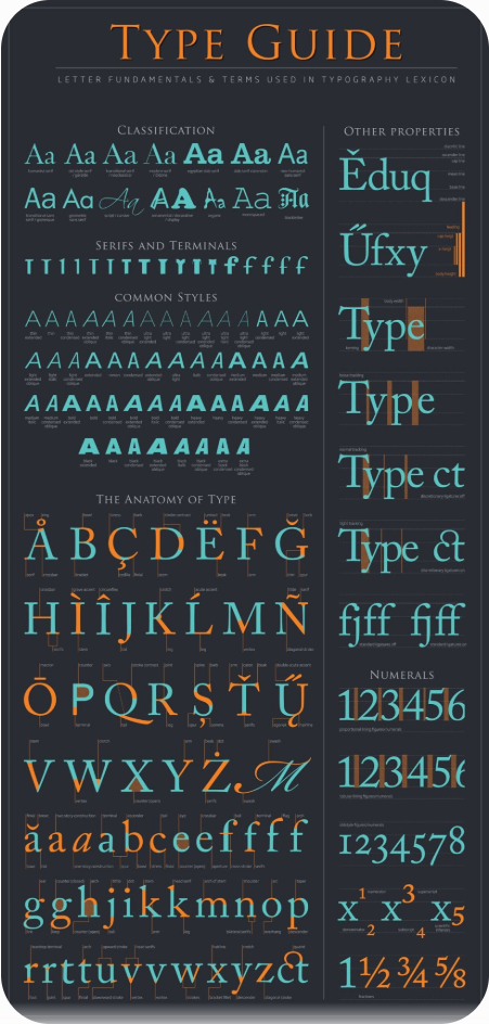
1. The Four Core Typography Classifications
Before you can pair fonts successfully, you need to understand the main typographic buckets and the underlying structural anatomy that gives them their distinct voice.
🏛️ Serif Fonts
-
The Anatomy: Recognized by the small decorative feet—called serifs—projecting from the ends of the main letter strokes.
-
The Personality: Traditional, authoritative, intellectual, and timeless.
-
Best For: Heritage brands, financial institutions, luxury fashion houses, and editorial blogs.
⚡ Sans-Serif Fonts
-
The Anatomy: “Sans” literally means “without.” These fonts feature clean, geometric cuts with zero decorative feet at the stroke terminals.
-
The Personality: Modern, minimalist, approachable, and highly efficient.
-
Best For: Tech startups, forward-thinking SaaS platforms, and digital-first applications where readability at tiny scale is vital.
🧱 Slab Serif Fonts
-
The Anatomy: A bold, muscular offshoot of traditional serifs. The structural feet are thick, blocky, and angular, closely mimicking a brick or slab.
-
The Personality: Rugged, industrious, confident, and punchy.
-
Best For: Outdoor apparel, construction companies, microbreweries, and fitness brands.
✒️ Script & Display Fonts
-
The Anatomy: Scripts mimic elegant cursive handwriting or fluid calligraphy. Display fonts are custom, highly stylized shapes designed purely to catch eyeballs at large sizes.
-
The Personality: Personal, creative, elegant, or intentionally eccentric.
-
Best For: Boutique brands, food packaging, and specialized creative agencies. (Warning: Use these strictly for focal points, never for long blocks of text!)
2. The Micro-Metrics: Fine-Tuning Your Type
Once you pick a baseline font, you need to format it like a professional. Rookie designers leave fonts on their default software settings. Master designers use three secret micro-metrics to make type look expensive:
-
Tracking (Letter Spacing): Adjusting the uniform spacing across a whole string of text. Spacing out a clean sans-serif wordmark makes it feel incredibly premium, airy, and high-fashion.
-
Kerning (Targeted Spacing): Adjusting the space between two specific individual letters. Letters like “V”, “A”, and “T” naturally create awkward empty gaps when placed next to each other. Manual kerning irons out those optical inconsistencies.
-
Hierarchy: Giving the eye an obvious reading path. Your company name should command the primary spotlight, while your tagline sits back to act as a supportive baseline.
3. The Rules of Engagement: How to Pair Fonts
When creating a logo lockup—the finalized structural layout combining your icon, company name, and tagline—you will often need to mix two different fonts. The goal is simple: Aim for contrast, avoid conflict.
If you pair two fonts that look vaguely similar (like two different geometric sans-serifs), they will fight for dominance, creating an uneasy visual friction. Instead, look for deliberate, harmonious opposites.
The Logo Font Pairing Matrix
To take the guesswork out of your layout process, follow these field-tested pairing strategies:
| Primary Header Font | Ideal Tagline Font | Why the Combination Works |
| Elegant Serif | Clean Sans-Serif | The modern, clean tagline grounds the old-world authority of the serif header. |
| Heavy Slab Serif | Light Geometric Sans | A thin, highly spaced tagline balances out the heavy weight of the slab. |
| Expressive Script | All-Caps Sans-Serif | The rigid, straight lines of the sans font anchor the wild, looping curves of the handwriting. |
| Bold Sans-Serif | Minimalist Light Serif | Creates an editorial, high-end lifestyle vibe perfect for boutique agencies. |
🚫 The Golden Constraint: Limit Your Font Count
Under no circumstances should you ever use more than two distinct font families in a single logo lockup. Introducing a third font fractures visual cohesion, making your brand assets look scattered and amateur. Keep it tight, keep it intentional.
Next Steps for Your Brand
When you map out your type selection, test your layout on the harshest canvas possible: invert it to pure black and white, shrink it down to the size of a postage stamp on your screen, and check it from across the room. If the fonts still cleanly communicate the brand’s identity and stay perfectly legible, you have successfully built a timeless typographic asset.


Leave a Reply