

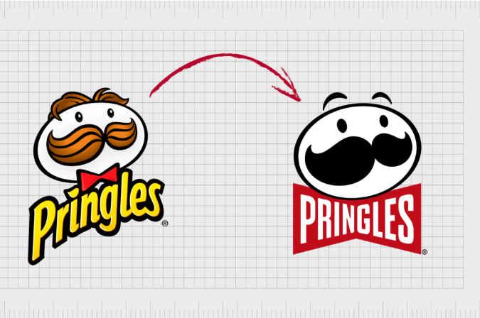
Every designer has been there. A client hands you their legacy logo, and it is an absolute maximalist circus. It has intricate hand-drawn illustrations, three different gradients, a tagline in tiny script font, and five contrasting colors.
They tell you, “We love our heritage, but it just doesn’t work on Instagram.”
They are entirely right. In today’s digital ecosystem, a logo needs to fit inside a tiny 32×32 pixel browser favicon, render clearly on a smartwatch screen, and be recognized by a user scrolling at warp speed through a TikTok feed. Complex logos fail because they create too much cognitive friction—the human brain takes too long to decode them.
Minimalist branding isn’t about making a logo boring; it’s about making it memorable and functional.
If you’re ready to declutter an over-designed brand identity without losing its soul, here is your practical step-by-step playbook from us at logodesigninspo.com.
1. The Diagnostic Tests: Is It Truly “Too Complex”?
Before cracking open Adobe Illustrator, run the legacy logo through these two brutal reality checks:
-
-
The Squint Test: Display the logo on your monitor, step back three feet, and squint your eyes. Do the design elements blur into an unrecognizable gray smudge, or does the core silhouette still communicate a clear shape? If it blurs, it has too many competing details.
-
The 1-Second Memory Rule: Show the logo to someone who has never seen it before for exactly one second. Cover it up, and ask them to sketch it on a napkin. If they can’t reproduce the basic concept, the visual hierarchy is broken.
-
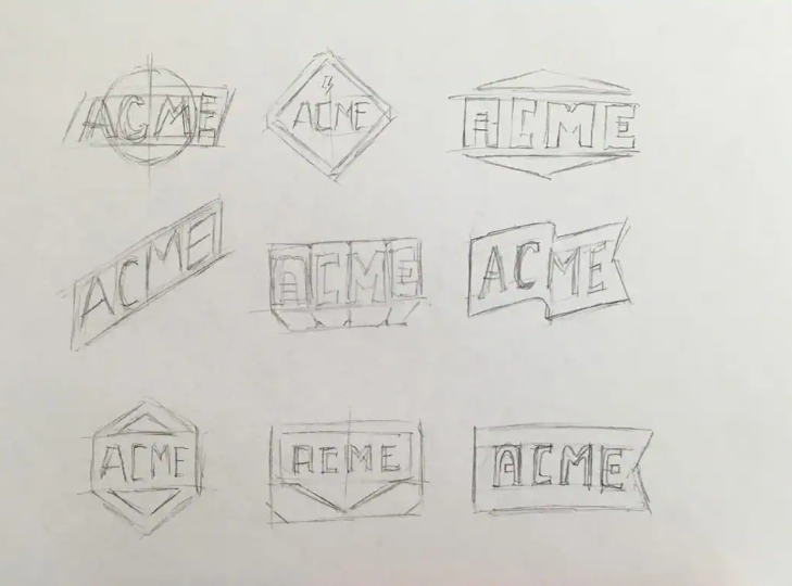
2. The Simplification Workflow
Simplifying a logo requires a surgical touch. If you strip away everything at once, you will alienate the client’s existing customer base. Instead, follow this precise, orderly sequence to peel back the layers methodically.
📊 Anatomy of a Rebrand: Complex vs. Minimalist
To guide your design choices, look at how the structural traits of old-school branding compare directly with modern, high-performance visual identities:
| Visual Attribute | The Complex Legacy Mark | The Simplified Minimalist Mark |
| Linework Thickness | Variable, thin, highly detailed lines | Uniform, bold strokes that scale down cleanly |
| Color Model | Multiple gradients or complex CMYK blends | Flat, solid RGB/Pantone color blocks |
| Typography | Decorative script or high-contrast serifs | Custom geometric sans-serif or refined serifs |
| Negative Space | Often ignored or filled with secondary shapes | Actively utilized to form hidden secondary meanings |
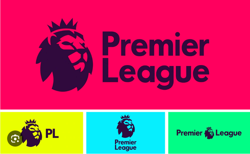
| Scalability Limit | Fails at sizes less than 150 pixels wide | Remains pristine down to 16 pixels wide |
3. The Golden Rule: “Subtraction as an Addition”
The ultimate master of minimalist design, Antoine de Saint-Exupéry, famously wrote: “Perfection is achieved, not when there is nothing more to add, but when there is nothing left to take away.”
When you present a simplified logo to a client, they might initially feel like they are getting “less” for their money. Your job as a professional designer is to reframe the conversation. You aren’t deleting their history; you are liberating their brand from the technical limitations of physical media so it can thrive in a digital-first economy. Less noise always equals more signal.


Leave a Reply