

When a consumer encounters your brand for the first time, their brain performs a series of lightning-fast cognitive computations. Long before they read your catchy tagline or analyze the geometry of your icon, they process one thing above all else: your brand color.
Studies show that up to 90% of snap judgments made about products are based on color alone. Color is the ultimate shortcut to the human subconscious. It bypasses logical filtering and triggers immediate, visceral emotional responses.
As identity designers and brand strategists over at logodesigninspo.com, we cannot treat color selection like a casual trip to the paint store. Your palette isn’t just a decorative veneer—it is a silent, continuous broadcast of your company’s core values, industry positioning, and psychological intent.
The Neurological Wireframe: The Emotional Impact of Color
To build a brand palette that converts, you must understand the established neurological baselines of the color wheel. Different wavelengths of light evoke deeply hardwired evolutionary and cultural feelings.
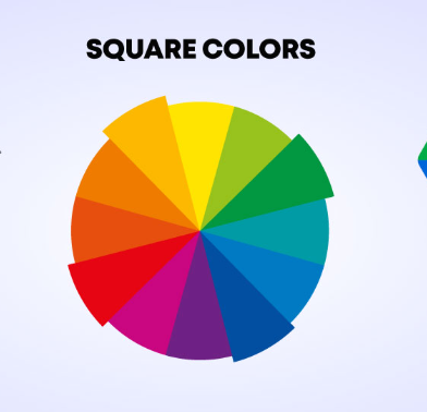
When analyzing how colors communicate, look closely at how the emotional wheel segments different spectrums into distinct personality archetypes. Let’s break down exactly what these major color groups communicate when applied to structural logo design.
Decoding the Corporate Color Spectrum
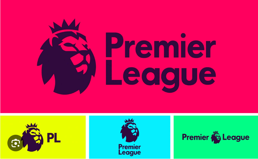
🔴 Red: Strength & Danger
Red has the longest wavelength of any color on the visible spectrum, meaning it physically appears closer to us than it actually is. It grabs immediate attention, elevates the heart rate, and creates a sense of primal urgency.
-
The Message: Passion, high energy, dominance, and speed.
-
Iconic Examples: Netflix, Coca-Cola, Target, Red Bull.
🔵 Blue: Trust & Sadness
Blue sits at the opposite end of the psychological spectrum. It triggers the release of calming chemicals in the brain, suggesting stability, deep oceans, and clear skies. It is the undisputed king of corporate logos, particularly in risk-averse fields.
-
The Message: Reliability, security, intelligence, and professional authority.
-
Iconic Examples: PayPal, Chase, Meta, Ford.
🟢 Green: Harmony & Growth
Green represents the natural world, freshness, and systemic balance. Because the human eye is capable of distinguishing more shades of green than any other color, it feels incredibly soothing and resting to our visual cortex.
-
The Message: Sustainability, health, ethical prosperity, and renewal.
-
Iconic Examples: Starbucks, Whole Foods, John Deere.
🟡 Yellow: Positivity & Enthusiasm
Yellow captures the eye faster than any other color—which is exactly why school buses and warning signs use it. In retail and branding, it injects a massive burst of accessible warmth and cheerful energy.
-
The Message: Optimism, youthful happiness, clarity, and affordability.
-
Iconic Examples: McDonald’s, IKEA, Snapchat, Ferrari.
🟠 Orange: Optimistic & Friendly
Orange combines the raw energy of red with the cheerful friendliness of yellow. It feels highly approachable, inviting, and inherently creative without carrying the aggressive, high-stakes warning signs of pure red.
-
The Message: Playful innovation, community, vitality, and action.
-
Iconic Examples: Fanta, Dunkin’, Nickelodeon, Mastercard.
🟣 Purple: Royal & Spiritual
Historically, purple dye was so rare and expensive that only monarchs could afford it. That luxury legacy survives intact today. It blends the stability of blue with the passion of red, creating a sense of mystique.
-
The Message: Premium luxury, creative wisdom, sophistication, and magic.
-
Iconic Examples: Hallmark, Cadbury, FedEx (the iconic “Ex” pop).
Quick-Reference Guide: Palette Selection vs. Brand Goals
To make this actionable for your next identity project, utilize this cross-reference matrix to align visual assets with market intent:
| Dominant Color | Primary Emotional Trigger | Best Suited Industries | The Hidden Risk |
| Red | Strength, Danger, Excitement | Food, Entertainment, Automotive | Can induce anxiety or aggression |
| Blue | Trust, Security, Calm | Finance, Tech, Healthcare | Can feel cold, detached, or generic |
| Green | Harmony, Growth, Freshness | Eco-Tech, Agriculture, Wellness | Can slip into passive “greenwashing” |
| Yellow | Positivity, Enthusiasm, Warmth | Fast Food, Logistics, Budget Retail | Overuse causes optical fatigue |
| Orange | Optimistic, Friendly, Playful | E-Commerce, Kids Brands, SaaS | Can occasionally look “cheap” |
| Purple | Royal, Spiritual, Luxury | Beauty, High-End Tech, Confectionery | Hard to render consistently in print |
The Golden Rules of Context and Contrast
While these psychological baselines are highly reliable, context is always king. A color does not operate in total isolation; its meaning shifts depending on how you layer it.
💡 The 60-30-10 Rule for Logo Frameworks
When establishing a brand identity system, avoid overcomplicating your palette. The most resilient global brands rely on a strict structural hierarchy:
60% Dominant Color: Sets the foundational emotional baseline (e.g., your primary corporate tone).
30% Secondary Accent: Creates structural depth and text legibility.
10% Focal Pop: Reserved purely for your call-to-action details or core icon intersections.
Furthermore, remember that subversion can be a massive competitive advantage. If every single bank in your city uses a blue logo to project “trust,” choosing an unexpected, vibrant purple or a rich orange can instantly slice through the market noise. You don’t always have to follow the industry template—as long as your alternative choice accurately mirrors your brand’s internal truth.


Leave a Reply