

Design trends age like open avocados. One minute a style is the freshest, coolest thing on the internet—think of the mid-2010s ultra-thin line art, the 2020s corporate Memphis blobs, or the hyper-glossy 3D glassmorphism we’ve seen floating around lately—and the next minute, it looks painfully dated.
If you design a logo based on what is currently trending on Dribbble or TikTok, you are essentially stamping an expiration date on your client’s brand. A corporate rebrand is an expensive, logistically exhausting nightmare. Businesses don’t want a logo that looks good for six months; they want an identity asset that will remain pristine, relevant, and authoritative a decade or more down the line.
To build a future-proof visual identity over at logodesigninspo.com, you have to look past the algorithmic hype cycles and anchor your creative choices in timeless design principles. Here is your definitive guide to designing a logo that stands the test of time.
1. Strip Away the “Right Now” (The Danger of Fads)
The secret to longevity is radical subtraction. When you are hit with an influx of new visual aesthetics, ask yourself: Will this style mean anything to a consumer in 2036?
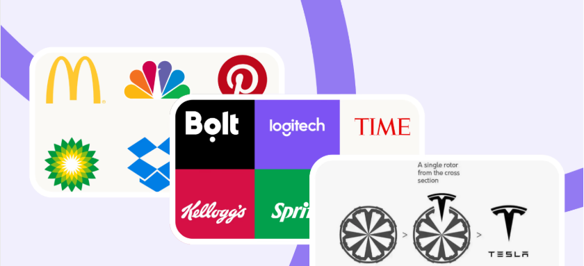
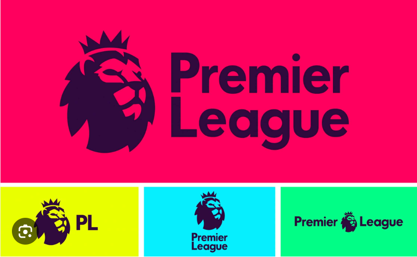
Timeless brands like Nike, Apple, and Target don’t chase trends; they outlast them. Their logos work because they have been boiled down to their absolute molecular minimums. They rely on pure, unadulterated geometric symmetry rather than stylistic parlor tricks.
The Golden Law of Longevity: Trends tell a consumer what year it is; great design tells a consumer who the company is. If your logo relies on a specific digital gradient mesh or an eccentric decorative font to look good, the underlying structure is weak.
2. Focus on a Singular, Powerful Concept
A timeless logo is always built around a central, bulletproof idea. It isn’t just a pretty shape; it is a visual metaphor.
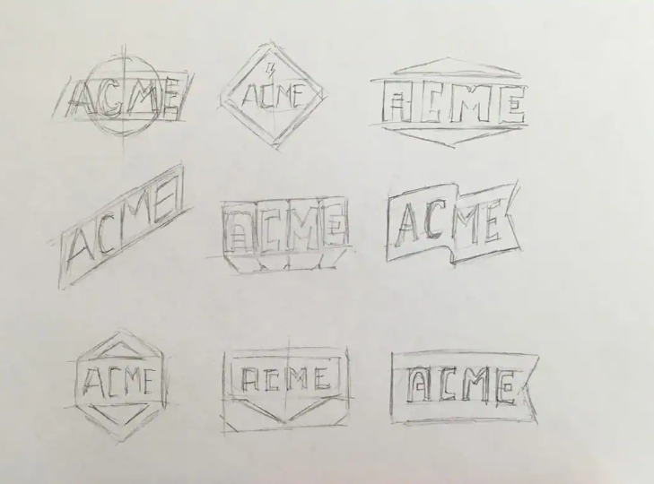
When you sit down to sketch (following our analog-first guides), don’t ask yourself how to make the shape look “cool.” Ask yourself what the core emotional anchor of the business is.
-
The Apple logo isn’t a masterclass in rendering fruit; it is a clean, memorable silhouette that represents knowledge, bite-sized accessibility, and rebellion against corporate beige boxes.
-
The Chase Bank octagon is a stylized representation of traditional wooden water pipes used in early New York infrastructure, subtly communicating deep, foundational stability.
If you bake a genuine narrative into the geometry of the mark, that narrative will remain true even as the technology used to display the logo evolves over the next century.
📊 Comparative Analysis: Trend-Chasing vs. Timeless Design
To help you audit your design concepts before presenting them to a client, evaluate your visual assets against this strict structural matrix:
| Architectural Metric | Trend-Chasing Identity | Timeless Identity System |
| Typography Selection | Ultra-stylized display scripts or viral novelty typefaces | Custom-tailored classic serifs or perfectly kerned geometric sans-serifs |
| Visual Styling | 3D bevels, complex shadows, organic hand-drawn squiggles | Flat 2D vector shapes, precise geometric alignment, locked grid paths |
| Color Blueprint | High-saturation neon palettes or hyper-faddish pastel duotones | High-contrast, iconic color systems that scale flawlessly to pure monochrome |
| Modular Scalability | Fails and turns muddy on small mobile screens or app interfaces | Functions seamlessly from a tiny favicon to a giant physical storefront pylon |
| Strategic Lifecycle | Requires a total visual overhaul every 2 to 3 years | Endures for decades, requiring only micro-pixel polishes over time |
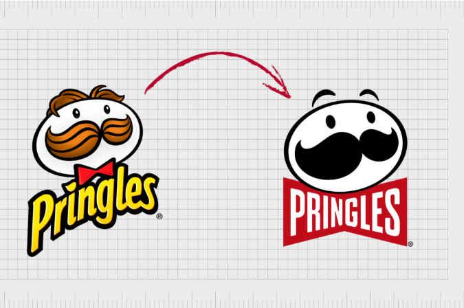
3. Emphasize Extreme Scalability and Simplicity
A logo that cannot scale is dead on arrival. In our current digital ecosystem, your design must be completely agnostic of its canvas. It has to survive inside an app icon, float inside a spatial computing headset, stitch cleanly onto a worker’s uniform, or engrave onto a premium product package.
The more intricate lines, dots, and overlapping shapes you add to a logo, the faster it will break under the pressure of scaling.
The “Photocopy” Endurance Test
If you want to know if your logo will survive the next 10 years, put it through the ultimate old-school stress test: Imagine printing your logo on a piece of cheap paper, putting it through a low-quality photocopy machine 10 times in a row, and then looking at the final result.
-
Do the thin lines disappear?
-
Do the small interior negative spaces bleed into solid blocks of black ink?
If the logo loses its clarity during this test, you need to go back to the digital artboard, expand your negative gaps, thicken your stroke profiles, and simplify the overarching silhouette.
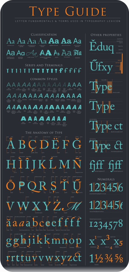
4. Choose Typography with Historic Authority
Nothing dates a logo faster than a bad font choice. Typefaces are highly cyclical; a font that feels cutting-edge today can feel incredibly corny in a matter of months.
When designing a wordmark or a lockup, lean into font families that possess deep historical authority. If you are using a serif font, look at the timeless, elegant proportions of traditional Roman letterforms (like Baskerville or Garamond variations). If you are deploying a modern sans-serif, look to the clean, mathematical perfection of mid-century Swiss design (like Helvetica or Futura baselines).
Don’t buy into the hyper-fanciful, distressed, or trendy display fonts floating around free font forums. If a client insists on a unique typographic voice, take a classic, stable font family and manually modify individual vector terminals, anchor points, or ligatures to give them an exclusive, custom edge that can’t be easily replicated or tied to a specific calendar year.
Final Thoughts for the Creative Explorer
Designing for longevity requires immense discipline. It means resisting the temptation to throw every new software trick at your canvas. It means having the candor to tell your client that their hyper-complex initial idea won’t survive the transition into a digital-first economy. Focus on the raw bones of your design, perfect the geometric balance, and trust that simplicity will always win the race against time.


Leave a Reply