

Color is seductive. When you are deep in the ideation phase of a new identity project over at logodesigninspo.com, it is incredibly tempting to grab a vibrant neon gradient, a rich pastel sunset palette, or a sophisticated metallic gold fill to make your concept pop off the screen.
But color is also a liar. It can easily blind you to fundamental structural flaws in your design.
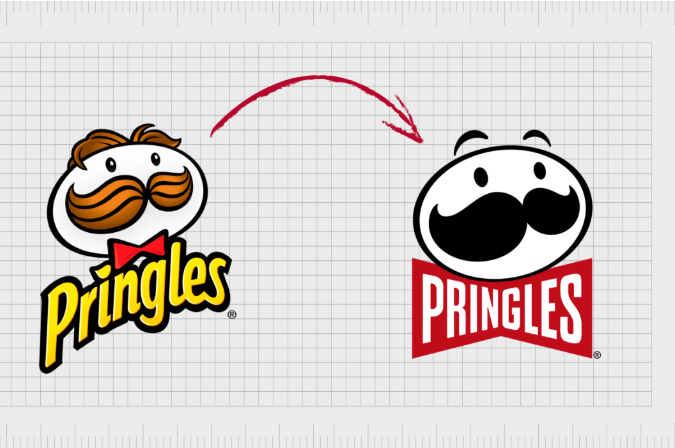
In the professional branding landscape, there is an unwritten, non-negotiable law that separates amateur hobbyists from elite corporate identity engineers: The Black and White Rule. It states that a logo must be completely designed, tested, and approved in pure monochrome (solid black and solid white) before a single drop of color is ever introduced.
If a logo relies on color to be understood, it is fundamentally broken. Here is a deep dive into the technical, cognitive, and practical reasons why every successful logo must work in black and white first.

1. The Color Crutch: Why Gradients Mask Weak Concepts
Rookie designers often use color as a cosmetic crutch. If a shape is generic, uninspired, or structurally unbalanced, throwing a striking color gradient or a trendy palette over it acts like a smoke screen. It tricks the client—and the designer—into thinking the logo is strong because it triggers an immediate sensory buzz.
However, a logo is not an illustration or a painting; it is a piece of minimalist communication architecture.
[Weak Shape + Flashy Gradient] ➡️ Strip Color ➡️ [Generic, Muddy Blur] ❌
[Strong Geometric Silhouette] ➡️ Strip Color ➡️ [Instant, Crisp Recognition]
When you strip a logo down to pure black ink on a white background, you expose its raw bones. You can no longer hide behind the emotional warmth of a soft blue or the high-energy excitement of a vibrant red. You are forced to confront the harsh reality of your composition:
-
Are the vector paths balanced?
-
Is the negative space active or passive?
-
Do the line weights hold up, or do they turn into an unreadable mess?
-
Is the silhouette unique and memorable?
If the logo fails to communicate its brand narrative cleanly in pure black and white, no amount of color theory or styling will ever save it.
2. The Cognitive Science: Shapes Outrun Color
From a neuroscientific perspective, the human visual cortex processes visual stimuli in a strict chronological hierarchy. When a consumer glances at your logo for a split second, their brain performs edge detection and maps out contrast long before it registers hue.
The brain’s rod cells (which detect light, shadow, values, and shapes) react significantly faster than cone cells (which decode color wavelengths). If your logo has a weak, muddy, or overcomplicated silhouette, the viewer’s brain experiences cognitive friction before it even has a chance to appreciate your beautiful brand palette.
By designing in monochrome first, you align your creative workflow directly with human biology. You guarantee that the foundational “shape-first” layer of human perception is flawlessly satisfied. Once the brain effortlessly decodes the structural silhouette, the color can then be introduced to act as an emotional amplifier.
3. The Production Reality: Real-World Technical Constraints
A logo cannot live its entire life inside the cozy, backlit paradise of an RGB computer screen. It is an industrial utility tool that must navigate the chaotic, high-contrast friction of the physical world.
Throughout a brand’s lifecycle, it will encounter printing environments where color is either physically impossible or prohibitively expensive. Let’s look at the harsh production tests a logo must survive:
| Production Touchpoint | Material Constraint | Why a Color Logo Fails | The Monochrome Solution |
| Laser Engraving | Etching directly into wood, glass, metal, or leather. | Gradients and colors turn into a flat, scorched blur. | Pure black vector lines map out exact physical cuts. |
| Embossing / Debossing | Pressing a shape into thick luxury paper or packaging. | Color does not exist; the mark relies 100% on shadow and depth. | The solid silhouette creates clean, beautiful 3D physical edges. |
| Embroidery | Stitching a logo onto a corporate polo shirt or cap. | Thread colors rarely match exact digital hex codes perfectly. | A strong solid shape translates cleanly into physical needle-and-thread paths. |
| Screen Printing | Stamping a logo onto merchandise, pens, or tote bags. | Every added color drastically increases setup and production costs. | A 1-color monochrome mark prints flawlessly for a fraction of the budget. |
| System Dark Mode | Smartphone interfaces shifting automatically based on ambient light. | Low-contrast colored text disappears against dark backgrounds. | A flexible monochrome mark inverts cleanly to solid white (#FFFFFF) with zero friction. |
4. The Actionable Workflow: How to Implement the Rule
To ensure your design process matches enterprise-level standards, integrate these four check-points into your identity production pipeline:
🎨 The Monochrome-First Pipeline
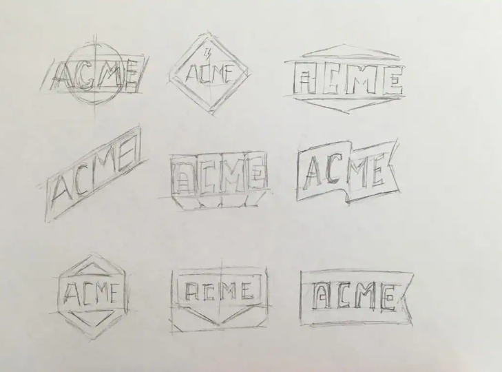
Step 1: The Sketch & Inking Phase
Brainstorm and build your vector geometry exclusively using black paths on a transparent or white artboard. If a shape feels like it “needs” color to make sense, delete it and sketch a bolder metaphor.
Step 2: The Background Contrast Inversion
Once your black logo looks pristine, select the entire lockup and flip it to pure white against a solid, dark charcoal or pitch-black background. Check if the negative spaces collapse or if the letters bleed into each other. If they do, adjust your kerning and expand your geometric gaps.
Step 3: The Scale Scaling Audit
Shrink your monochrome mark down to a tiny $24 \times 24$ pixel thumbnail on your screen. Stand up, walk to the other side of the room, and look back. If the solid black silhouette remains perfectly readable, its structural scaling architecture is sound.
Step 4: The Emotional Color Overlay
Only after your logo has successfully passed the monochrome silhouette, contrast inversion, and scaling audits are you allowed to open your color swatches. Apply color to give the logo its emotional setting, tone, and industry alignment.
Final Thoughts for Your Brand Portfolio
The next time you analyze an iconic rebrand or study an elite identity system, look past the initial color choices. Invert the design in your mind to pure solid ink. You will quickly realize that the timelessness of a logo isn’t driven by its palette; it is driven by the structural integrity of its silhouette. Design the bones first, and the rest will fall into place naturally.


Leave a Reply