

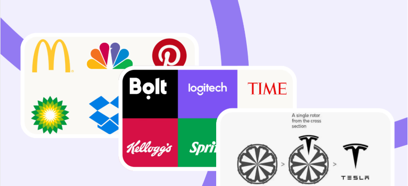
Take a close look at the world’s most iconic logos—the Apple silhouette, the Toyota ellipses, or the Target bullseye. To the untrained eye, they look beautifully simple. But if you strip away the color fills and reveal the underlying vector paths, you’ll find a hidden labyrinth of intersecting circles, parallel angles, and strict mathematical grids.
Some amateur designers dismiss logo grids as corporate overkill or a constraint on raw creativity. But over here at logodesigninspo.com, we view the grid entirely differently: it is the architectural scaffolding that elevates a loose, chaotic sketch into a timeless, pixel-perfect brand asset.
A great logo needs to scale from a microscopic $16 \times 16$ pixel smartwatch favicon to a massive stadium billboard without losing its structural integrity. To achieve that level of resilience, you need to master the laws of geometry and symmetry. Let’s break down how to use logo grids to inject mathematical harmony into your next identity project.
1. What is a Logo Grid (and Why Do You Need One)?
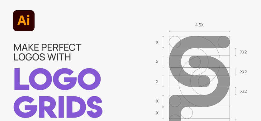
A logo grid is a tool used to geometricize a design by creating a system of spatial constraints. It is built using an anchor framework of intersecting lines, squares, angles, and circles.
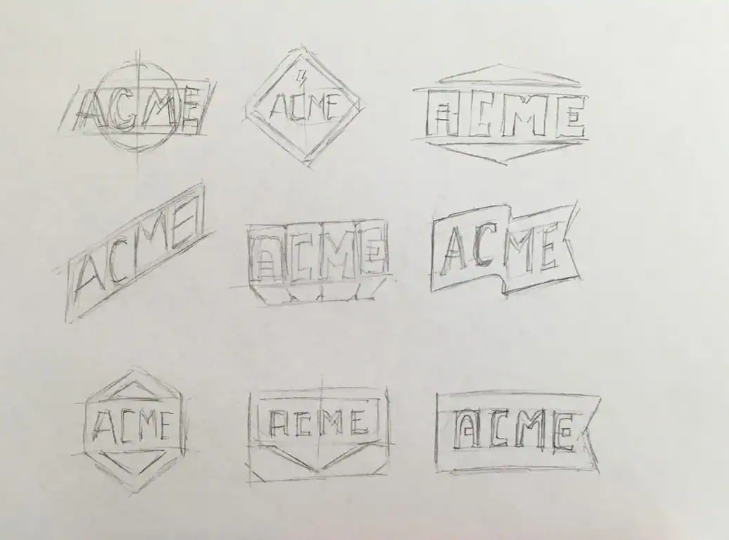
You don’t use a grid to invent an idea; you use it to refine an idea. Once you have digitized your rough sketch (using the workflow from our previous Design Guides), the grid acts as your digital blueprint, ensuring every curve, gap, and edge aligns to a logical rhythm.
The Core Benefits of Gridding
-
Visual Cohesion: When different elements of a logo share the exact same geometric DNA (e.g., sharing the same arc radius), the human brain instantly registers the design as organized and professional.
-
Infinite Scalability: Logos anchored to a strict geometric grid don’t distort or look awkward when shrunken down. Their proportions remain mathematically locked.
-
The “Wow” Factor for Clients: Presenting a finalized logo lockup alongside its geometric construction grid proves your value. It demonstrates to the client that their logo isn’t just a random drawing—it is an engineered piece of brand architecture.
2. The Core Tools of the Geometric Grid

When building a professional grid system in Adobe Illustrator or Affinity Designer, you aren’t just drawing random lines. You are deploying three distinct mathematical pillars:
📐 Consistent Angles and Vectors
Never freehand your diagonals. Decide on a strict angular palette early in the design phase. Relying on clean divisions of a circle—such as $30^\circ$, $45^\circ$, or $60^\circ$ angles—creates an immediate sense of forward momentum and structural rhythm. If a line slants at $45^\circ$ on the left side of your logo, every corresponding diagonal should match that trajectory.
⭕ Interlocking Circles and Ellipses
The smoothest curves in graphic design are born from circles. Instead of drawing an organic curve with the Pen Tool, drop down perfect circles and use their outer edges to slice through your shapes. By using the same circle diameter across different parts of the logo, you create an invisible visual echo that ties the entire silhouette together.
🏛️ The Golden Ratio
For centuries, artists and architects have used the Golden Ratio to achieve peak aesthetic perfection. Derived from the Fibonacci sequence, this mathematical ratio can be expressed as:
By scaling your logo elements using the proportion $1 : 1.618$ (such as making an outer circle $1.618$ times larger than an inner circle), you tap into a geometric proportion that humans are evolutionary hardwired to find beautiful and balanced.
📊 Design Philosophy: Mathematical vs. Over-Gridded Systems
While grids are incredibly powerful, there is a dangerous trap in modern identity design: over-gridding. Let’s look at how to balance structure with practicality:
| Gridding Approach | Visual Characteristics | Market Impact | Best Applied To |
| The Harmonized Grid (The Pro Standard) | Simple, intentional construction lines; uses geometry to clean up organic ideas. | Memorable, flexible, and structurally sound across all digital mediums. | 95% of enterprise brands, tech SaaS, and consumer goods. |
| Over-Gridding (The Designer’s Trap) | Hundreds of unnecessary intersecting circles; forces shapes into an unnatural grid. | Sterile, overly complex, and often yields unreadable or generic silhouettes. | Theoretical design concepts or purely abstract art pieces. |
3. The Ultimate Trap: Mathematical vs. Optical Balance
Here is a vital piece of candor that every professional identity designer must learn: The computer is smart, but the human eye is weird.
If you rely 100% on mathematical symmetry, your logo will occasionally look completely crooked to the human brain. This phenomenon is driven by how our minds perceive negative space, mass, and weight.
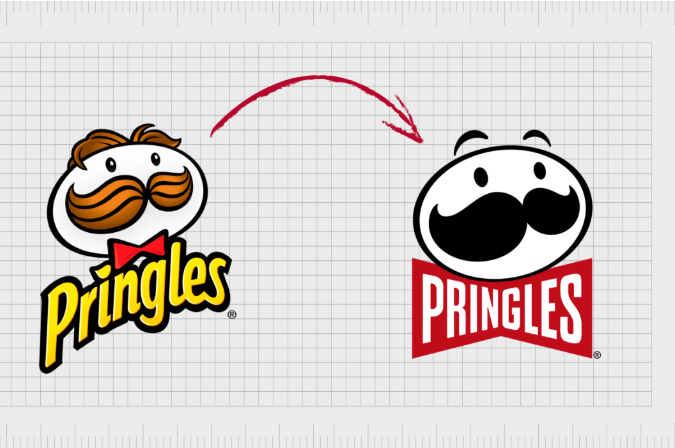
🛑 The Classic “Play Button” Paradox
Take a perfect triangle and place it inside a perfect circle. If you use your design software’s alignment tool to center the triangle mathematically along the horizontal axis, the logo will look wrong. It will appear to be sagging or slipping to the left.
Why? Because a triangle has significantly more visual mass at its flat base than at its pointed tip. To make it look balanced to a human user, you must manually nudge the triangle slightly to the right. This is called optical alignment.
Always remember that the grid is a guide, not a prison. Use geometry to establish your initial baseline, but give yourself permission to break the grid by a few pixels if your eyes tell you that a shape needs breathing room.
4. Step-by-Step: How to Construct a Logo Grid System
Ready to implement this on your next project? Follow this field-tested production workflow:
-
Drop Your Sketch to Low Opacity: Place your refined analog drawing on a locked background layer inside your vector software at 30% opacity.
-
Establish Your Baseline Unit: Create a master circle or square that represents the core thickness or radius of your design. Duplicate this shape to create a modular kit of parts.
-
Construct the Scaffold: Lay down your primary geometric shapes directly over the sketch. Use your software’s alignment panel to ensure your circles share identical center anchor points and your diagonals intersect flawlessly.
-
Execute the Shape Builder Tool: Once your vector grid lines resemble a complex blueprint, select all paths. Grab the Shape Builder Tool (Shift + M) and cleanly click-and-drag through the grid segments you want to fuse together, while holding
Alt/Optionto delete the external waste lines. -
Audit the Vector Nodes: Clean up your paths. A perfectly gridded logo should have a minimal amount of vector anchor points. Ensure handles are perfectly horizontal or vertical wherever curves peak to guarantee flawless rendering.


Leave a Reply