There was a time when a brand’s visual identity was set in stone. Designers would deliver a single, beautifully crafted corporate logo lockup, and that asset would remain untouched whether it was stamped on a giant billboard, printed in a black-and-white newspaper ad, or slapped onto the back of a business card.
But the static logo is dead.
In today’s digital landscape, your logo is a digital nomad. On any given day, it might need to display on a massive 32-inch ultra-wide monitor, scale down to a microscopic browser favicon, render inside a smartphone app notification, or float smoothly inside a spatial computing headset. If you try to force a complex, highly detailed master logo into a $16 \times 16$ pixel canvas, it won’t look premium—it will look like an unreadable smudge.
To build a truly future-proof brand over at logodesigninspo.com, you must embrace the era of the Responsive Logo System. Here is your definitive guide to crafting an identity that seamlessly adapts to any screen size without losing its core visual power.
1. What Exactly is a Responsive Logo?
A responsive logo is not just a graphic that you shrink or enlarge using CSS. True responsiveness is about scaling down structural complexity, not just changing file dimensions.
As the available screen real estate shrinks, a responsive logo strategically sheds layers of detail—dropping long taglines, removing intricate line shading, and simplifying its geometry—while preserving the exact same color psychology and core visual DNA. The goal is simple: maximize legibility at every single breakpoint.
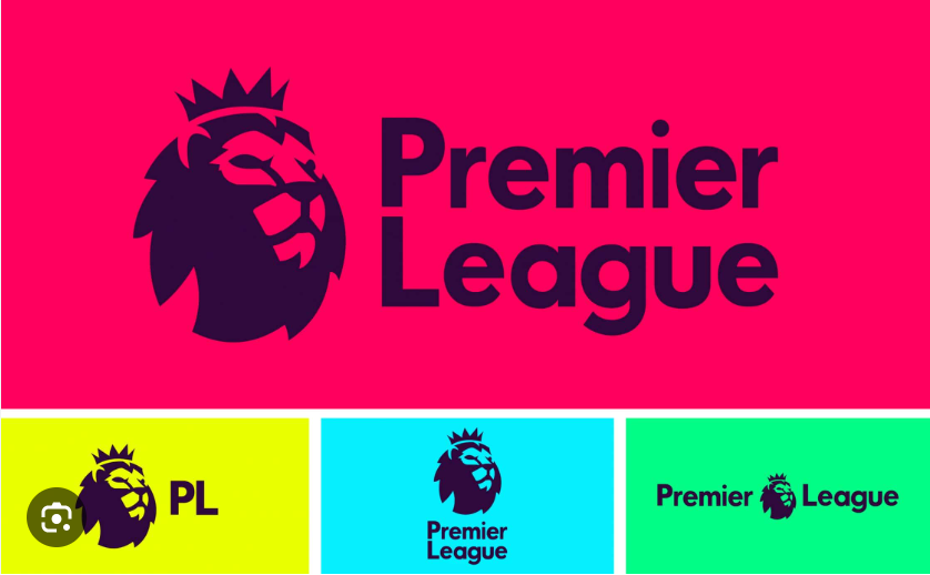
2. The Four Tiers of a Responsive Logo System
When building an identity ecosystem for a modern client, you should never hand over a single file. Instead, you need to deliver a modular family of assets configured into a strict hierarchy of responsive tiers:
[Tier 1: Master Logo] ➡️ [Tier 2: Compact Mark] ➡️ [Tier 3: Simple Monogram] ➡️ [Tier 4: Pure Icon]
👑 Tier 1: The Master Logo (Full Context)
This is the ultimate, uncompromised version of the identity. It includes the primary icon, the full brand name in its custom typography, and the corporate tagline or established location identifier.
-
Best Used For: Desktop website headers, large corporate presentations, physical office signage, and main product packaging.
📐 Tier 2: The Compact Mark (No Tagline)
The first layer of subtraction. When screen real estate drops, the first element to become illegible is almost always the tagline. In this tier, the tagline is completely deleted, and the tracking (letter-spacing) of the main wordmark is often broadened slightly to improve readability on mobile viewports.
-
Best Used For: Tablet interfaces, standard digital banners, and social media banners.
✒️ Tier 3: The Minimal Monogram (Text-Dominant)
When shifting to vertical formats or constrained spaces like app navbars, the full wordmark might still be too wide. The monogram strips the brand name down to its core initials or a single stylized capital letter, paired cleanly with a simplified version of the primary icon shape.
-
Best Used For: Smartphone navigation bars, email headers, and corporate invoice templates.
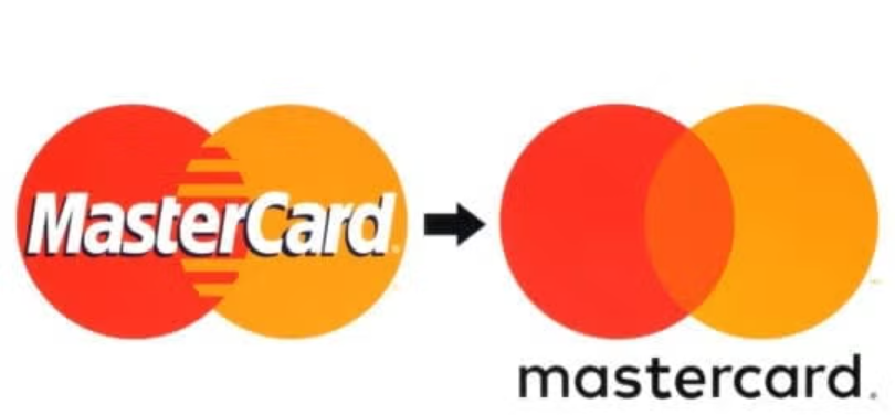
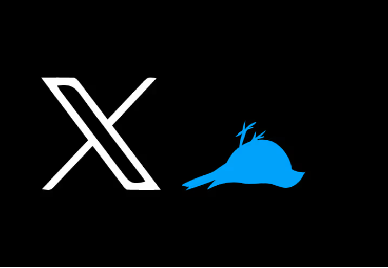
🎯 Tier 4: The Pure Icon / Favicon (The Essential Essence)
The ultimate distillation of the brand. All typography, names, and auxiliary lines are completely stripped away. You are left with nothing but the pure, unadulterated icon or symbol. If someone looks at this tiny mark for half a second, they must instantly recognize the overarching corporate entity.
-
Best Used For: Browser favicons, smartphone app icons, smartwatch displays, and circular social media avatars (Instagram/X profiles).
📊 Structural Breakdown: Responsive Asset Deployment
To visualize how a professional responsive design system operates, look at how the design constraints shift across different digital and physical viewports:
| Responsive Tier | Detail Density | Primary Channels | Core Design Constraint |
| Tier 1: Master | High (Includes tagline) | Desktop web, print media, signage | Requires clear background padding |
| Tier 2: Compact | Medium (Icon + Wordmark) | Mobile web viewports, digital ads | Prioritizes horizontal balance |
| Tier 3: Monogram | Low (Initials or single letter) | Navbar components, app footprints | Requires high typographic contrast |
| Tier 4: Pure Icon | Minimal (Symbol only) | Favicons, app avatars, wearable UI | Must pass the “squint test” at tiny scales |
3. The Golden Rules of Responsive Design
Before you start sketching your next responsive project, keep these three field-tested rules in mind to ensure your assets remain pristine across the digital spectrum:
📌 Rule 1: Master the “Squint Test”
When designing a logo on your massive, beautiful desktop monitor, it is easy to trick yourself into thinking an intricate detail looks amazing. Periodically zoom out to 10%, sit back in your chair, and squint your eyes. If the shapes blend together into a chaotic blur, your paths are too close together. Increase the negative space or simplify the curves.
📌 Rule 2: Invert the Stroke Scale Factor
As shapes scale down, thin lines naturally disappear, and thick lines bleed into their neighboring negative spaces. When creating the Tier 4 Icon version of a logo, you will almost always need to manually increase the relative stroke thickness and expand the interior gaps compared to the Master Logo version to counteract optical blending on low-resolution mobile displays.
📌 Rule 3: Kill the Gradients at Small Scales
Rich color gradients and subtle drop shadows require large surfaces to create their smooth, volumetric illusions. On a tiny smart-widget notification, a gradient just looks like a muddy, low-quality compression error. Ensure your Tier 3 and Tier 4 marks utilize flat, high-contrast vector fills that pop effortlessly against dark and light mode screens alike.


Leave a Reply