

Every design legend has a creation myth involving a napkin. We love the romanticized image of a designer struck by a sudden bolt of genius in a dimly lit coffee shop, scribbling down a crude shape that effortlessly becomes a million-dollar brand asset.
But here is the candid truth we embrace at logodesigninspo.com: a napkin sketch is just a ghost. It’s a fleeting spark of an idea. The real magic—and the true mark of a professional identity designer—happens during the rigorous, technical translation of that messy analog scribble into a flawless, mathematically precise digital vector file.
If your creative process gets stuck or loses its soul the moment you move from paper to the screen, you are not alone. This step-by-step guide breaks down the professional workflow required to bridge the gap between raw analog imagination and pixel-perfect digital execution.
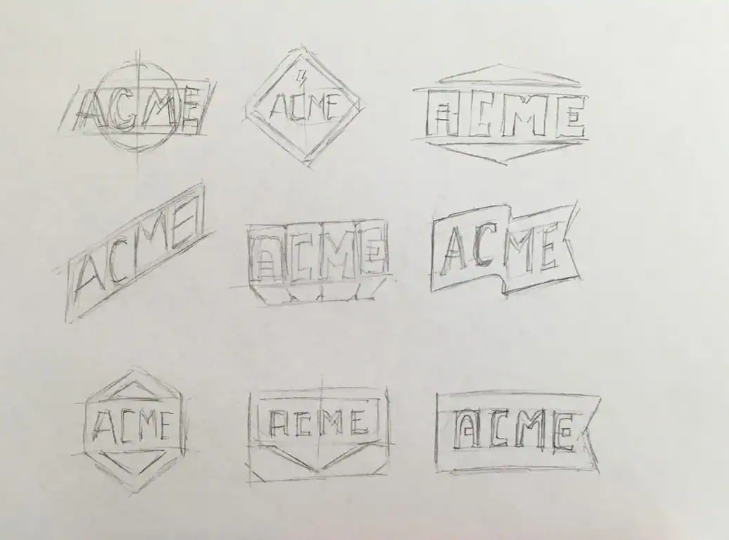
Phase 1: The Messy Canvas (Brainstorming & Loose Sketching)
Before you touch a mouse or a digital stylus, your brain needs to move faster than software allows. Digital design programs naturally force you to think about straight lines, perfect circles, and geometric constraints too early, which instantly chokes out raw creativity.
-
Embrace the Low Stakes: Grab a cheap notebook, a loose piece of printer paper, or yes, a cocktail napkin. Use a soft pencil or a fluid felt-tip pen.
-
Quantity Over Quality: Do not try to draw a masterpiece on your first attempt. Sketch 20, 30, or 50 quick variations of a concept. Force your brain to exhaust the obvious, generic ideas (like a literal lightbulb for an “ideation” company) so you can dig into deeper, more abstract metaphors.
-
The Selection Cut: Once your pages are full of chaotic scribbles, step away for an hour. When you return with fresh eyes, circle the 2 or 3 concepts that possess a strong visual silhouette, even in their crudest form.
Phase 2: Analog Refinement (The Ink-Up)
You’ve found your winning sketch, but it’s still too messy to digitize cleanly. Tracing a faint, blurry pencil line in your design software will result in jagged, uneven digital vectors. You need to prep your artwork for the scanner.
💡 Pro-Tip: The Optical Clean-Up
Take a fresh sheet of paper (tracing paper works best) and place it over your chosen rough sketch. Using a dark, heavy black fine-liner pen, trace over your lines with deliberate, confident strokes. Smooth out the curves, even out the line weights by hand, and fill in solid shapes.
Once your refined ink sketch is complete, capture it. You don’t need a high-end flatbed scanner; a clear, well-lit smartphone photo taken directly from above works perfectly.
Phase 3: The Digital Import & Software Setup
Open your vector software of choice (Adobe Illustrator, Affinity Designer, or Figma). Create a new document using an RGB color profile (since most modern logos live primarily on screens) and place your sketch image onto a dedicated bottom layer.
-
Drop the Opacity: Lower the opacity of your sketch layer to around 30% or 40%. This turns your drawing into a faint guide, making it easy to see your new digital lines over the top.
-
Lock the Layer: Lock this background layer completely so you don’t accidentally click and drag your sketch around while working.
-
Create a Vector Work-Layer: Create a fresh layer directly on top. This is your digital construction site.
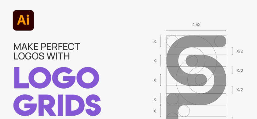
Phase 4: Geometric Construction Over Freehand Tracing
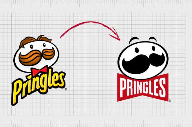
This is where amateur designers separate themselves from professionals. When digitizing a sketch, a rookie will grab the Pen Tool and frantically click along the lines of the drawing, trying to trace it like a coloring book. This creates an unstable vector file packed with hundreds of unnecessary anchor points, resulting in lumpy curves and amateur silhouettes.
Professionals build; they don’t trace. They look at the sketch and dissect it into foundational geometric primitives—circles, ellipses, rectangles, and polygons.
[Messy Hand-Drawn Curve] ➡️ [Perfect Geometric Overlap] ➡️ [Shape Builder Fusion]
-
The Geometry Method: If your sketch features a curved shield or an organic teardrop, don’t draw it freehand. Drop down perfect circles and intersecting straight vector paths that align with the core boundaries of your sketch.
-
The Shape Builder Fusion: Use tools like Illustrator’s Shape Builder Tool or Boolean operations (Unite, Intersect, Subtract) to trim away the overlapping external lines and fuse the geometric shapes into a single, beautifully harmonized icon.
-
The Anchor Point Rule: If you must use the Pen Tool for organic shapes, remember the ultimate law of vector geometry: Less is always more. Place your anchor points strictly at the outermost extremes of your curves (the highest, lowest, furthest left, and furthest right points). Keep your Bezier handles parallel and uniform to ensure the curve remains mathematically smooth.
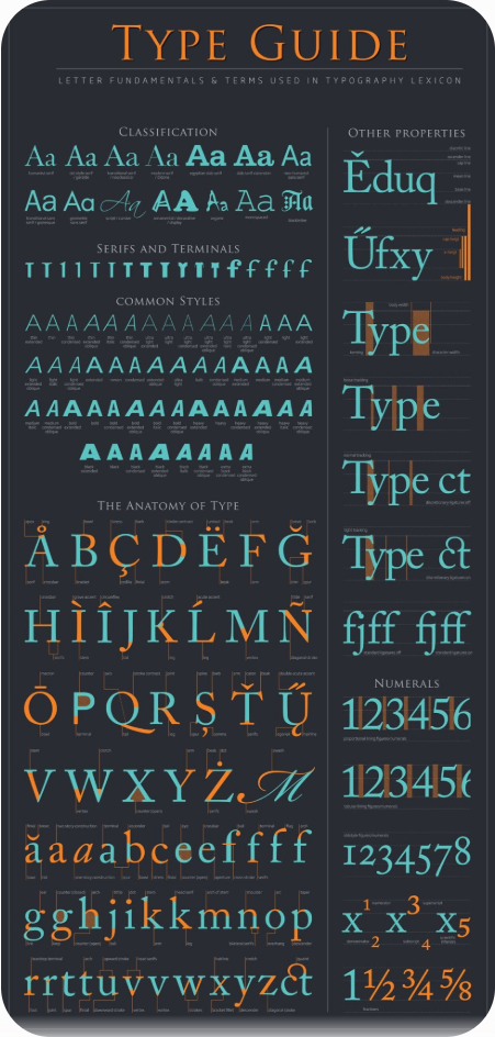
Technical Baseline: Why Raster is the Enemy of Logos
To ensure your final asset functions correctly out in the wild, it must be saved in a vector format. Let’s look at why professional identity design completely rejects standard pixel-based imagery:
| Asset Metric | Raster Images (JPEG, PNG) | Vector Graphics (AI, EPS, SVG) |
| Structural DNA | Built from a fixed grid of colored pixels | Built from mathematical coordinate equations |
| Scaling Capability | Becomes blurry, pixelated, and jagged when enlarged | Infinitely scalable from a favicon to a massive billboard |
| File Flexibility | Hard to edit, separate colors, or manipulate paths | Elements can be decoupled and recolored instantly |
| Industry Purpose | Best for rich photography and complex digital textures | Non-negotiable standard for corporate logo systems |
Phase 5: Stress-Testing & Final Delivery
Once your vector geometry is flawlessly locked down, it’s time to apply color and typography (following the structural rules outlined in our other Design Guides here on logodesigninspo.com). Before you export the final files to your client, put the design through the ultimate industry stress-test:
The Obsidian Test: Flip the entire logo into pure, high-contrast silhouette black against a solid white artboard, then reverse it to pure white against a pitch-black canvas. If your logo relies on color gradients or subtle shadows to be understood, it will fail this test. A resilient logo communicates its message purely through its structural silhouette.
Finally, package your assets professionally. Deliver clean, unmerged .AI or .EPS files alongside web-optimized, transparent .SVG formats. When you deliver an identity built on clean vector geometry rather than a traced sketch, you give your client an asset that will scale seamlessly alongside their business for decades to come.


Leave a Reply