

An exceptional logo mark can be instantly ruined by bad typography. You could spend hours tweaking the vector curves of a pristine geometric icon, but if the company name underneath feels disjointed, the entire brand identity loses its credibility.
Traditionally, finding the perfect font pairing meant opening a font manager, scrolling through thousands of typefaces, and manually guessing which weights matched. If you paired two fonts that were too similar, they conflicted. If they were too different, they looked messy.
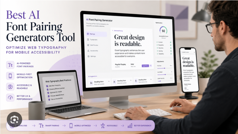
In 2026, artificial intelligence has turned this time-consuming guessing game into a precise science. Modern typography tools use deep learning models to analyze the visual characteristics of letterforms—such as x-height, stroke contrast, and geometric weight—to generate flawless pairings in a single click.
Over at logodesigninspo.com, we focus on high-efficiency workflows. Here is the ultimate guide to the best AI-powered typography tools to lock down the perfect type system for your next branding project.
1. The Neural Network Matchmaker: Fontjoy
Fontjoy is a brilliant, minimal tool that approaches font pairing through the lens of machine learning. Instead of using arbitrary human tags, Fontjoy utilizes a neural network to map out font characteristics as multi-dimensional vectors.
-
How It Works: The system allows you to adjust a simple slider ranging from “high contrast” to “balanced similarity.” When you hit generate, the AI calculates the visual distance between font structures to find combinations that match your desired level of contrast.
-
Why It Wins: The intuitive layout lets you test real-time brand name mockups immediately. You can lock your primary logo font in the header slot and let the AI instantly cycle through perfectly mathematically balanced sub-headers and body fonts.
2. The Enterprise Foundational Engine: Monotype AI
For designers dealing with premium or corporate brand systems, Monotype’s specialized AI engine represents the gold standard in commercial type discovery.
-
How It Works: Monotype’s AI is trained on an immense library of historic and modern type design blueprints. Instead of just picking trendy combinations, its algorithmic model searches for fonts that share core structural DNA, historical eras, or specific psychological moods.
-
Why It Wins: It goes far beyond standard Google Fonts. If a client loves an incredibly expensive, niche serif typeface, Monotype’s system can instantly analyze its geometry to find accessible, highly cohesive pairings that maintain an upscale corporate aesthetic.
3. The Specialized Logo Laboratory: Typogram
While generic pairing tools look at font blocks for websites or articles, Typogram is built from the ground up strictly for logo designers and brand architects.
-
How It Works: Typogram uses a guided AI wizard to help you build text-based logos without needing advanced vector manipulation skills. It analyzes your brand personality inputs to recommend precise letterform styles.
-
Why It Wins: It breaks typography down into editable features. The platform guides you through adjusting ligatures (connected letters), letter spacing, and specific font weights while dynamically serving up pairing combinations that match the structural alterations you make to the primary logo mark.
📊 The AI Typography Stack: Side-by-Side Comparison
Depending on your client’s budget and the technical complexity of the project, use this matrix to select your platform:
| AI Typography Tool | Core Technical Superpower | Ideal Production Phase | Library Access |
| Fontjoy | Neural net contrast-ratio calculation | Rapid early-stage brainstorming | Google Fonts |
| Monotype AI | Deep semantic and historical matching | High-end corporate brand design | Premium Foundries |
| Typogram | On-canvas vector text manipulation | Creating standalone wordmarks | Curated Open-Source |
| Fontpair.co | Trend-focused algorithmic curation | Fast landing page & UI styling | Google Fonts |
⚡ The Step-by-Step AI Font Pairing Workflow
To get clean, professional results that avoid looking generic, do not let the AI make 100% of the creative choices. Instead, use this systematic production pipeline to steer the machine:
💡 The Golden Rule of Branding Typography
In a logo system, your fonts shouldn’t fight for attention. If the primary logo typeface has a lot of unique personality or unusual angles, your secondary supporting font must be incredibly simple and utilitarian. Two highly expressive fonts placed right next to each other creates instant visual chaos.
By substituting manual scrolling with targeted AI typography engines, you can confidently build highly legible, mathematically balanced type systems that instantly elevate your client projects to a global, professional standard.


Leave a Reply