

In the real estate industry, property transactions represent some of the largest financial decisions a person will make in their lifetime. Whether your clients are buying their first home, investing in commercial developments, or looking for luxury penthouses, they all seek one foundational trait above all else: Trust.
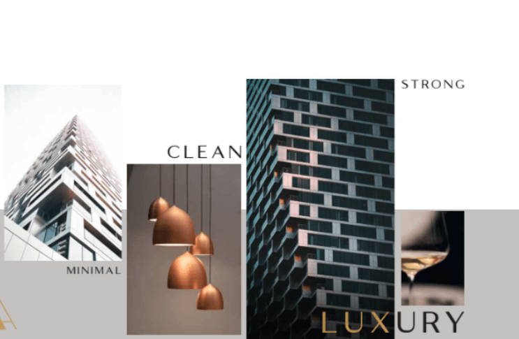
Your logo is the first point of contact for your brand. It serves as a visual anchor that communicates stability, professionalism, and forward-thinking expertise. However, the days of the overused, generic “triangle rooftop” logo are over. Modern real estate branding requires sophisticated geometry, clever symbolism, and clean execution to stand out in a highly competitive market.
To help you design a brand identity that commands authority and establishes immediate credibility, we have curated 20 modern real estate logo ideas designed to build instant trust.
1. Geometric & Architectural Precision (Ideas 1–5)
Architectural accuracy and clean geometric lines signal blueprint precision, structural integrity, and professional mastery. These concepts work exceptionally well for property developers and modern real estate agencies.
-
The Continuous Blueprint Line: A logo drawn with a single, unbroken vector line that traces the outline of a modern skyscape or structural foundation. It represents seamless transactions and meticulous planning.
-
The Isometric Room: A clean 3D isometric cube where the shading and lines create a subtle, open-concept living space in the negative space. It projects spatial awareness and modern design.
-
The Golden Ratio Arch: A perfectly balanced, semicircular architectural arch designed using the golden ratio. It evokes timeless elegance and foundational strength, reminiscent of luxury property entries.
-
The Monolithic Pylon: A stark, minimalist vertical pillar with clean cutouts that form the initial of the agency. It communicates unshakeable market stability and growth.
-
The Interlocking Corner Bracket: Two bold, L-shaped geometric brackets interlocking to form an abstract structure. This emphasizes the concept of secure partnerships, construction quality, and rock-solid reliability.
2. Premium & Luxury Brokerages (Ideas 6–10)
High-end brokerages dealing in luxury estates and premium commercial spaces need logos that exude exclusivity, heritage, and refined sophistication.
-
The Matte Black Block Monogram: A heavy, bold typographic monogram featuring the agency’s initials, placed inside a sharp rectangular frame. Executed in matte black and metallic gold, it screams high-end corporate authority.
-
The Heritage Gate Emblem: A delicate, fine-line crest that subtly mimics the elegant wrought-iron gates of historic luxury estates, wrapping around a classic serif wordmark.
-
The Abstract Serif Roofline: Moving away from cheesy rooftops, this concept uses the exaggerated, elegant serif foot of a capital letter (like an ‘A’ or ‘H’) to subtly hint at a structural ceiling or shelter.
-
The Velvet Geometric Ribbon: A fluid, overlapping ribbon graphic that twists to form both an infinity loop and the abstract outline of a premium high-rise building.
-
The Sovereign Compass: A minimalist, four-point star or compass integrated into the brand mark, signaling guidance, elite concierge service, and finding the perfect luxury destination.
3. Sustainable, Green & Community-Centric (Ideas 11–15)
With the massive rise of eco-friendly housing, smart cities, and suburban community developments, these concepts leverage organic shapes and neighborhood motifs to foster warmth and connection.
-
The Community Leaf Grid: A 2×2 grid of clean squares where the negative space between the blocks forms a delicate tree or leaf pattern, representing eco-friendly residential developments and neighborhood growth.
-
The Nested Neighborhood Circles: Three overlapping, concentric circles of varying sizes, symbolizing inclusivity, family, community, and finding your place within a safe environment.
-
The Solar-Circuit Icon: A clean, modern house silhouette where the roof seamlessly blends into a tech-forward circuit pattern or solar grid lines, perfect for smart-home real estate firms.
-
The Topographic Wave Badge: A circular badge containing clean, curved topographic lines that represent land development, acreage, and coastal or scenic real estate.
-
The Interconnected Courtyard: A top-down geometric floor plan layout abstracted into a beautiful, symmetrical icon that speaks to multifamily housing and commercial community hubs.
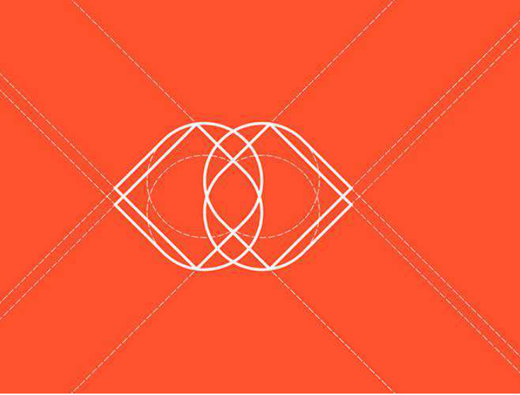
4. Typographic & Negative Space Authority (Ideas 16–20)
Clever, thought-provoking design elements make a brand unforgettable. Using negative space or custom typography shows intelligence and attention to detail, which directly translates to client trust.
-
The Negative Space Keyhole: A modern shield or corporate block logo where the negative space in the center perfectly cuts out the silhouette of a classic keyhole, symbolizing security and unlocking new opportunities.
-
The Dynamic Arrow Wordmark: A custom sans-serif font for the agency’s name where the crossbar of the letter ‘E’ or ‘A’ is modified into a clean, forward-pointing arrow, indicating market progress and forward momentum.
-
The Doorway Initial: A bold typographic lettermark where a vertical slice of the letter is styled to look like an open, welcoming door or an inviting structural entrance.
-
The Structural Crossbar: A minimalist wordmark where a solid horizontal line extends across the entire length of the logo text, acting as a visual “beam” or “foundation” supporting the brand.
-
The Pillars of Trust: A text-only logo using an ultra-premium, heavy serif font where the vertical stems of the letters are mathematically aligned to resemble classic stone pillars, evoking institutional strength.
💡 Smart Branding Rules for Real Estate Logos
To ensure your real estate logo functions flawlessly across lawn signs, digital listings, and corporate contracts, keep these strategic guidelines in mind:
1. The Color Psychology of Trust: Color choices in real estate are critical. Deep Navy Blue communicates corporate security and professionalism; Forest or Emerald Green signals wealth, growth, and eco-friendly spaces; Charcoal Slate provides a sleek, modern, and solid foundation. Avoid overly trendy neon colors that compromise credibility.
2. The Yard Sign Visibility Test: A real estate logo must be instantly readable from a moving car. If your icon is too intricate or your font is too thin, it will blur on a physical lawn sign or billboard. Bold, clean lines win every time.
3. Ditch the Literal Clichés: If you want to project high-level authority, avoid drawing literal windows, chimneys, or picket fences. True modern trust comes from abstraction, letting the premium quality of the design speak for the premium quality of your service.


Leave a Reply