

In the visual landscape of 2026, noise is everywhere. Brands are constantly shouting for attention through flashing digital ads, complex animations, and crowded interfaces. Amidst this chaos, minimalism isn’t just a design choice—it is a superpower.
Minimalist logo design operates on a simple philosophy: strip away the non-essential until only the raw essence of the brand remains. A truly great minimalist logo doesn’t lack detail; it is packed with meaning, executed with absolute restraint. By using clean lines, basic geometric shapes, and purposeful whitespace, these logos achieve maximum memorability, effortless scalability, and a timeless aesthetic that refuses to go out of style.
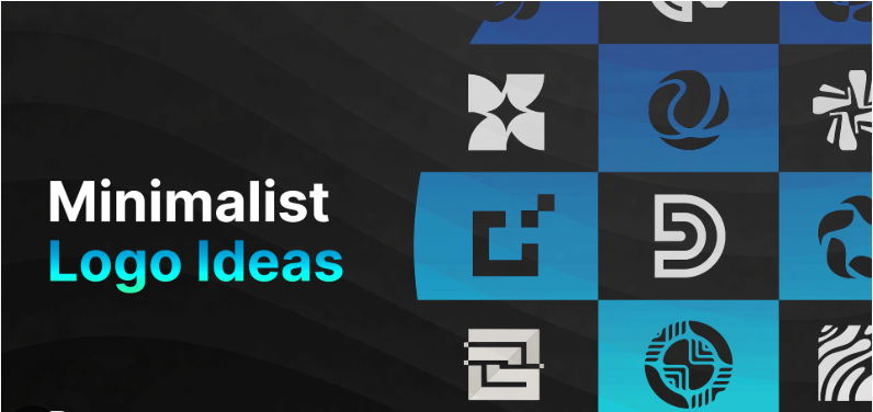
Whether you are launching a modern tech startup, a premium skincare line, or an avant-garde fashion boutique, here are 50 fresh minimalist logo design ideas to give your brand an unforgettable visual identity.
1. Pure Geometry & Structural Form (Ideas 1–12)
Geometry speaks a universal language. Utilizing mathematically balanced shapes creates an immediate sense of stability, logic, and corporate authority.
-
The Perfect Circle Cut: A solid, bold circle featuring a single, razor-thin diagonal slice passing through its center to symbolize precision and breaking boundaries.
-
Overlapping Transparent Squares: Two identical squares overlapping slightly, using a subtle overlay opacity to create a third, distinct color shade at their intersection.
-
The Isometric Wireframe Cube: A clean 3D cube rendered using only ultra-thin, uniform vector lines, projecting themes of architecture, technology, and spatial computing.
-
The Symmetrical Triangle Peak: An elegant, equilateral triangle split cleanly down the center by a line of negative space, evoking a modern mountain peak or upward progress.
-
The Split Hexagon: A sharp hexagon divided horizontally into two interlocking halves, communicating security, data structure, and modular integration.
-
The Floating Arc: A single, sweeping semi-circular arc hovering perfectly above a solid, minimalist horizontal line.
-
Concentric Ripple Rings: Three concentric circles of varying line weights that mimic the clean look of a water ripple or sound wave.
-
The Sharp Chevron Grid: Two minimal V-shaped chevrons stacked vertically, pointing aggressively forward to project momentum and velocity.
-
The Segmented Circle: A thick circular ring missing a precise $90^\circ$ quadrant, leaving a clean, open gap that draws the eye inward.
-
The Parallel Monoliths: Two thick, vertical rectangles placed side-by-side with microscopic spacing, symbolizing unshakeable partnership and stability.
-
The Nested Rhombus: A smaller, solid diamond shape suspended perfectly inside the hollow outline of a larger, thin-lined diamond.
-
The Golden Ratio Spiral: A highly abstracted, geometric interpretation of the Fibonacci sequence curve, rendered in a single, flawless line.
2. Mastering Negative Space (Ideas 13–25)
Negative space logos are the ultimate intellectual design flex. By hiding a second shape inside the blank spaces of the primary icon, you create an instant “aha!” moment for your audience.
-
The Hidden Forward Arrow: A bold, blocky wordmark where the negative space trapped between two specific letters (like ‘E’ and ‘X’) forms a perfect forward-pointing arrow.
-
The Keyhole Circle: A minimalist solid black circle where the negative space in the lower half seamlessly cuts out the silhouette of a classic keyhole.
-
The Dual Profile: A single geometric line that simultaneously traces the structural edge of a building on one side and a clean human profile on the other.
-
The Sliced Initial: A bold, capital initial lettermark where a diagonal wave of negative space slices through the center, making the letter appear beautifully deconstructed.
-
The Missing Corner: A solid, heavy black square where one corner has been completely deleted, leaving a clean white void that hints at an open door or a portal.
-
The Embedded Silhouette: A simple geometric shape (like a shield or hexagon) where the white space in the center perfectly drops out the shape of your product (e.g., a bottle, leaf, or bolt).
-
The Continuous Gap: A logo icon made of several solid bars where a single wave of negative space flows horizontally through all of them, binding them together conceptually.
-
Shadow Geometry: An icon that relies on the absence of lines, using contrasting dark and light geometric planes to force the viewer’s brain to fill in the shape.
-
Interlocking Voids: Two hollow geometric rings that do not physically touch, but their inner negative spaces overlap to form a third hidden shape.
-
The Subtracted Line: A modern wordmark where a single, continuous horizontal line is subtracted out of the middle of the text, giving it a futuristic, cybernetic look.
-
The Eclipse Crescent: A large solid circle partially overlapping a smaller one, using negative space to leave behind a sharp, elegant crescent moon.
-
The Enclosed Contrast: A solid black rectangle containing a perfectly white, minimalist geometric icon completely isolated in its core.
-
The Broken Frame: A thin rectangular border where the lines intentionally stop short of touching at the corners, letting the background flow into the logo.
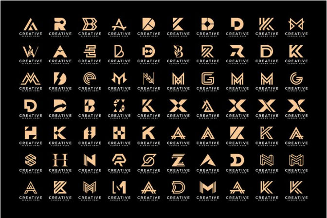
3. Elegant Typography & Monograms (Ideas 26–38)
Typographic minimalism focuses on the beauty of the letterforms themselves. Customizing just one single aspect of a font can elevate it into a premium luxury logo.
-
The Invisible Crossbar: A clean sans-serif capital letter ‘A’ or ‘H’ where the horizontal crossbar is completely removed, leaving an ultra-minimalist, open aesthetic.
-
The Hairline Serif: A custom typeface where the main stems of the letters are thick and bold, but the serifs (the little feet) are drawn as razor-thin, elegant hairlines.
-
The Monogram Ligature: Two initials fused together into a single, seamless glyph, where the ending stroke of the first letter directly acts as the starting stroke of the second.
-
The Stencil Sans: A modern, geometric sans-serif typeface where small, strategic gaps are sliced into the curved joints of each letter.
-
The Single-Dot Monogram: A highly minimalist, lowercase initial lettermark accompanied by a single, perfectly balanced solid dot directly to its right or above it.
-
The Vertical Wordmark: A typography-focused logo where the brand name is stacked vertically, with the letters rotated $90^\circ$ to challenge traditional reading layouts.
-
Lowercase Elegance: Using an ultra-clean, lightweight lowercase font for a luxury brand name, projecting approachable sophistication and modern humility.
-
The Wrapped Letter: A clean capital letter where a single line from the character extends outward and wraps completely around itself like a protective ribbon.
-
The Geometric Initial: An initial letter built entirely out of basic geometric building blocks—a perfect semicircle, a straight line, and a single square.
-
Overlapping Glyphs: A short brand name where the individual letters are pushed close together, overlapping seamlessly to form a single, continuous typographic chain.
-
Extended Tracking Wordmark: A bold, capital serif font where the spacing between each individual letter (tracking) is stretched out dramatically, conveying luxury, space, and premium status.
-
The Curved Terminal: A custom-modified font where the sharp corners of the letters are subtly smoothed out into gentle, radiused curves.
-
The Block Letter Cutout: A heavy, solid block initial where a clean geometric shape is punched straight through the center of the letter’s thickest stem.
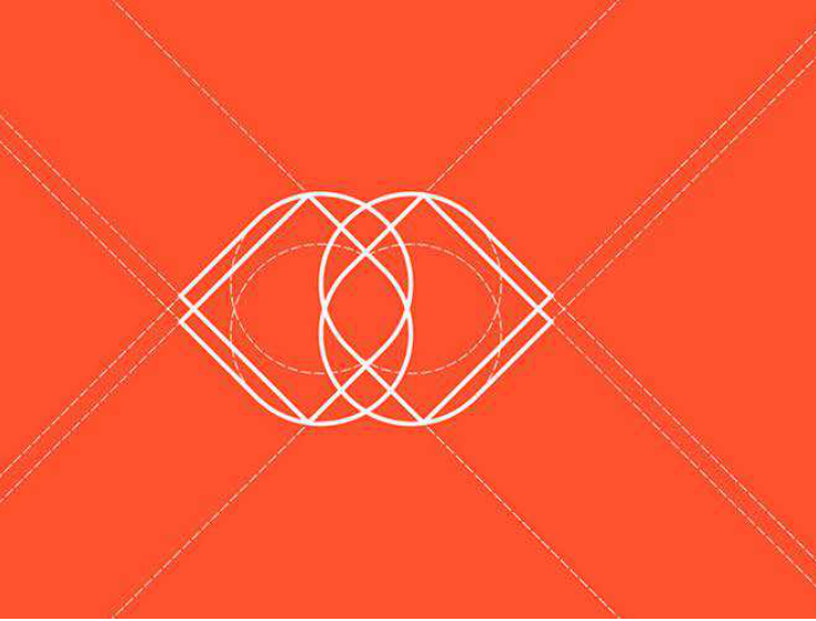
4. Single-Line Art & Abstract Concepts (Ideas 39–50)
Line art relies on fluid, artistic execution. By using a single line of uniform thickness, these logos capture complex concepts with absolute elegance and clarity.
-
The Continuous Vector Loop: An abstract logo icon drawn from start to finish without a single break in the line, looping seamlessly to form an organic shape.
-
The Infinite Knot: A highly stylized, minimal interpretation of a Celtic knot or Mobius strip using flat, uniform line weights.
-
The Stylized Ripple: Two parallel, wavy lines that bend in perfect harmony, capturing the concept of fluid motion, water, or smooth transitions.
-
The Topographic Curve: A single, elegantly curved line that mimics the natural elevation markings of a topographic map, perfect for outdoor or land-based brands.
-
The Minimalist Horizon: A solid horizontal line intersected by a clean, rising semi-circle, perfectly capturing a sunset, sunrise, or a fresh dawn.
-
The Abstract Prism: A simple wireframe outline of a pyramid or crystal that appears to shift shapes depending on how the viewer focuses on the lines.
-
The Single Slash: A bold brand wordmark accompanied by nothing but a single, sharp, angled forward slash (
/) at the end, signaling forward momentum. -
The Kinetic Vector Trail: A solid dot leading a faint, elegant line trail behind it, beautifully capturing data transmission, physics, or speed.
-
The Folded Ribbon: A single line that folds over itself at sharp angles, using basic overlapping to simulate a 3D ribbon effect in a flat 2D space.
-
The Cross-Section Angle: A minimalist architectural icon showing the exact intersection point where two perpendicular lines meet and form a sharp coordinate point.
-
The Digital Spark: A simple, clean four-point starburst built entirely from two intersecting, lightweight lines.
-
The Fluid Core: An abstract, irregular organic shape drawn with minimal anchor points, celebrating natural imperfection and fluid evolution.
💡 The Golden Rules of Minimalist Logo Design
To ensure your minimalist concept delivers the maximum possible brand impact across all mediums, strictly adhere to these three design principles:
1. The Favicon Test is Everything: A minimalist logo must be incredibly resilient. If your design cannot scale down to a $16 \times 16$ pixel browser tab icon or an app notification badge and still be recognizable, it is still too complicated. Strip away more elements.
2. Rely on Shape, Not Color: True minimalist excellence means the design functions perfectly in pure, solid monochrome. Never use gradients, complex shadows, or multiple color palettes to mask a weak core shape. If it doesn’t look stunning in plain black on a white background, back to the drawing board.
3. Perfect the Kerning and Alignment: When you have very few elements on the canvas, even a fractional error in alignment or letter-spacing (kerning) becomes glaringly obvious. Spend extra time ensuring the mathematical grid, line weights, and visual balance are completely flawless.


Leave a Reply