

They say we eat with our eyes first. Long before a customer smells the wood-fired smoke of your grill, tastes the delicate crumb of your pastry, or reads your menu, they see your logo. In the culinary industry, a logo is the visual appetizer—it sets expectations for the flavor, atmosphere, and quality of the dining experience to come.
A truly successful food or restaurant logo does more than look pretty; it stimulates the appetite, evokes emotion, and captures the “secret sauce” of your brand. Whether you are launching a high-end Michelin-starred establishment, a bustling street-food truck, or a cozy neighborhood bakery, your visual identity needs to look mouthwatering.
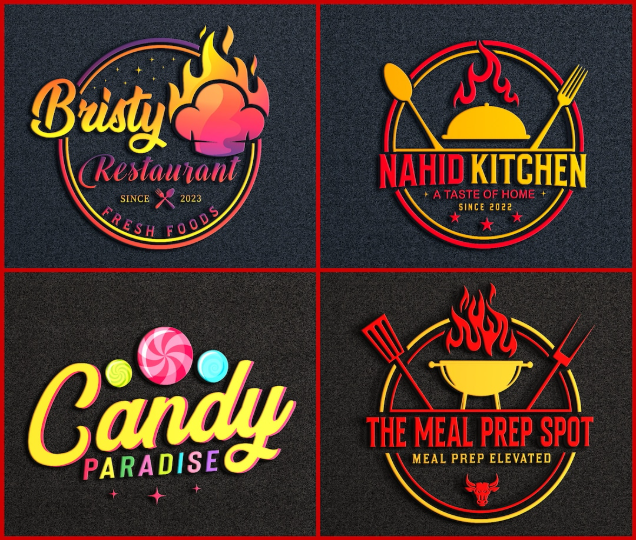
To get your creative juices flowing, we have curated 35 delicious restaurant and food logo ideas broken down by culinary style and branding vibe.
1. Fine Dining & Gastronomy Sophistication (Ideas 1–9)
Luxury dining relies on restraint, precision, and elegance. These concepts use minimalist geometry, clean lines, and deep color palettes to project high-end culinary artistry.
-
The Single-Line Cloche: An elegant, continuous-line drawing tracing the silhouette of a classic silver serving cloche, with a tiny wisp of abstract steam escaping the rim.
-
The Interlocking Monogram Utensils: A high-contrast serif monogram where the negative space of the letters subtly forms the delicate tines of a fork or the sleek bowl of a gourmet spoon.
-
The Golden Ratio Wheat Crest: A perfectly symmetrical, geometric crest featuring stylized wheat stalks designed using the golden ratio, communicating premium, artisanal quality.
-
The Abstract Flame Profile: A clean, modern icon that blends the silhouette of a chef’s profile with a sleek, geometric flame, perfect for upscale steakhouses or open-fire kitchens.
-
Minimalist Botanical Frame: A thin, delicate square frame containing a single line-art illustration of a culinary herb, like rosemary or thyme, paired with a widely spaced serif wordmark.
-
The Horizon Pour: A horizontal line representing the surface of wine or liquid inside an invisible, abstract glass, topped with a single, sharp vector star.
-
The Layered Ingredient Block: Three clean, overlapping colored blocks in rich tones (truffle black, olive green, saffron yellow) representing the art of stacking and plating fine food.
-
The Deconstructed Whisk: A geometric, architectural interpretation of a wire whisk using ultra-thin gold lines on a dark charcoal background.
-
The Terroir Stamp: A circular, textured wax-seal style logo featuring a minimalist mountain or field icon, ideal for farm-to-table fine dining celebrating local terroir.
2. Cozy Bakeries, Cafes & Sweet Spots (Ideas 10–18)
Baking and dessert branding should feel warm, comforting, and delightfully indulgent. These concepts evoke nostalgia, handmade care, and sweet temptations.
-
The Rolling Pin Typography: A vintage sans-serif wordmark where the center of the text is gracefully integrated into the wooden barrel of a classic rolling pin drawing.
-
The Whimsical Flour Cloud: A soft, cloud-like doodle representing a puff of flour, shaped subtly into a mixing bowl or a chef’s hat.
-
The Melting Chocolate Droplet: A sleek typographic logo where the base of a letter (like a ‘B’ or ‘D’) looks like it is melting into a smooth, glossy droplet of chocolate.
-
The Retro Pastry Ribbon: A script-font logo enclosed in a sweeping, circular ribbon graphic that mimics a perfectly piped swirl of buttercream frosting.
-
The Crossed Whisk & Rolling Pin Shield: A traditional, cozy emblem featuring a crossed baking whisk and rolling pin behind a rustic, hand-drawn shield.
-
The Grain & Moon Crest: A delicate crescent moon built entirely from tiny, detailed grains of wheat and oats, framing a warm, inviting brand name.
-
The Neon Sugar Script: A bright, playful neon-sign aesthetic using cursive typography, perfect for late-night dessert bars or trendy donut shops.
-
The Steaming Pie Silhouette: A minimalist vector icon of a classic lattice-topped pie, with the steam lines curving up to form the initials of the bakery.
-
The Artisan Oven Brick: A sturdy, textured block logo resembling an old stone oven brick, stamped with clean, simple typography that screams “wood-fired tradition.”
3. High-Energy Fast Casual & Street Food (Ideas 19–27)
Street food and fast-casual joints need bold, punchy, and highly memorable logos that command attention from a distance and pop on social media.
-
The Playful Bite Mark: A bold, geometric circle icon (representing a burger, taco, or pizza) with a clean, stylized bite mark taken out of the side, revealing the layers inside.
-
The Fire-Breathing Mascot: A friendly, vintage cartoon mascot (like a chili pepper, chicken, or taco dude) breathing a small, playful vector flame to emphasize spice.
-
The Neon Food Truck Badge: A shield-style badge incorporating the clean vector silhouette of a food truck grid, utilizing vibrant contrast colors like electric orange and charcoal.
-
The Chopstick Vortex: Two minimalist, intersecting chopsticks creating a dynamic, circular spiral effect that mimics a spinning bowl of noodles or wok-tossed street food.
-
Brutalist Block Sauce: Ultra-bold, heavy block lettering where the bottom of the text looks like it is dripping with a rich, savory sauce.
-
The Skewer Cross: Two crossed bamboo skewers holding abstract, colorful geometric shapes (representing meats and veggies) to form a modern kebab or yakitori mark.
-
The Sizzling Grill Lines: A minimalist square containing three bold, horizontal grill-mark slashes over a warm gradient background, radiating heat and flavor.
-
The Animated Steam Burst: A modern typographic logo where a lively, comic-style steam explosion bursts out from behind the restaurant’s name.
-
The Urban Pizza Slice: A sharp, geometric triangle styled with minimalist abstract dots to represent a slice of New York-style pizza, paired with gritty, urban typography.
4. Farm-to-Table, Organic & Green Eateries (Ideas 28–35)
For restaurants focusing on health, sustainability, and plant-based menus, logos should lean into organic textures, botanical honesty, and earthy grounding.
-
The Pitchfork & Carrot Fusion: A clever vector icon where the prongs of a rustic garden pitchfork seamlessly morph into the leafy green tops of a freshly harvested carrot.
-
The Topographic Circle Badge: A circular badge filled with clean, flowing topographic map lines, emphasizing a deep connection to the earth, land, and local sourcing.
-
The Wooden Crate Stamp: A distressed, imperfect stencil logo that looks like it was raw-stamped onto a wooden farmer’s market vegetable crate.
-
The Sprout Initial: A clean, modern sans-serif initial where a tiny, vibrant green leaf sprout grows out from the crossbar or stem of the letter.
-
The Sun & Soil Horizon: A minimalist circle divided horizontally, with the top half showing a clean, rising sun and the bottom half featuring raw, textured soil lines.
-
The Linocut Chef’s Hands: A beautiful, detailed linocut-style illustration of a chef’s hands gently cradling a bundle of freshly picked organic vegetables.
-
The Earthy Terracotta Block: A solid, warm terracotta-colored rectangular block with the restaurant’s name cut out in bold, raw negative space, projecting grounding and warmth.
-
The Interlocking Vine Border: A clean, modern square frame made entirely of interlocking botanical vines, housing a minimalist serif brand name in the center.
💡 Color Psychology: The Secret Ingredient of Food Branding
When designing a food logo, color isn’t just an aesthetic choice—it’s a biological trigger. Keep these psychological color rules in mind for your culinary brand:
Red & Yellow (The Appetite Stimulators): These high-energy colors are scientifically proven to increase heart rates and stimulate appetite. They work perfectly for fast casual, street food, and lively diners.
Green & Earth Tones (The Freshness Factors): Greens, browns, and soft terracottas communicate health, sustainability, organic sourcing, and relaxation. Essential for vegan, vegetarian, and farm-to-table concepts.
Black, Gold & Charcoal (The Luxury Palette): Dark, monochromatic schemes paired with subtle metallic accents signal prestige, mystery, and high-end exclusivity. Use these if you want to command premium menu prices.


Leave a Reply