

In the vast universe of visual identity, the monogram remains an undisputed classic. From historic high-end fashion houses like Chanel and Louis Vuitton to modern tech disruptors like HP and General Electric, letter-based logos have a legendary track record.
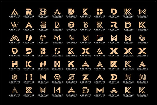
Why do monograms possess such staying power? Because they compress a brand’s entire identity into a single, highly legible, and deeply memorable shorthand symbol. When you strip away literal illustrations of products and focus entirely on the geometry of letters, you unlock a timeless aesthetic that functions beautifully across any canvas—whether it is a tiny 16×16 pixel website favicon, an embroidered shirt cuff, or a giant illuminated billboard.
To spark your creative engine and elevate your branding, we have curated 40 creative letter-based logo concepts, broken down into four distinct structural styles.
1. Interlocking & Woven Ligatures (Concepts 1–10)
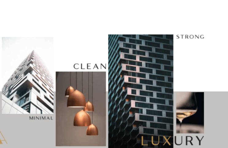
Perfect for luxury boutiques, premium hospitality, and heritage brands, interlocking ligatures combine two or more initials into a unified, elegant puzzle where the lines gracefully overlap.
-
The Hairline Overlap: A high-contrast monogram where the razor-thin hairline strokes of two serif letters seamlessly weave through each other’s thick vertical stems.
-
The Mirror-Image Split: A symmetrical design featuring a primary initial facing forward, perfectly matched on the left by its exact reversed mirror image, creating a balanced crest.
-
The Celtic Weave Initial: A single-line vector monogram where the letters pass over and under each other rhythmically, mimicking traditional Celtic knotwork.
-
The Infinite Knot Monogram: Two uppercase initials modified into smooth, rounded shapes that loop together continuously to form an abstract infinity symbol (
∞). -
The Vintage Stencil Split: A classic luxury monogram where microscopic, intentional gaps are sliced into the overlapping joints of the letters, giving it a bespoke editorial look.
-
The Floating Serif Connect: Two letters placed side-by-side where the extended top serifs (the tiny feet of the letters) touch and merge into a single, elegant horizontal bridge.
-
The High-Contrast Shadow: A monogram that uses a subtle, negative-space drop shadow layer between the overlapping letters to create depth without adding complex lines.
-
The Corporate Monolith: A heavy, bold block monogram enclosed tightly inside a sharp rectangular or square frame, communicating institutional strength.
-
The Triple-Letter Cascade: For three-initial brands, a vertically stacked layout where the top letter steps down diagonally into the second, which flows into the third.
-
The Filigree Crest: A modern, minimal monogram centered inside a delicate, hand-etched wreath of vintage ornamental flourishes.
2. Minimalist & Negative Space Typography (Concepts 11–20)
Minimalist letterforms use subtraction to challenge the viewer’s eye. By removing expected lines or hiding secondary symbols in the white space, these concepts project intelligence and modern wit.
-
The Invisible Crossbar: An ultra-clean sans-serif capital letter “A” or “H” where the central horizontal crossbar is completely removed, leaving an open, futuristic aesthetic.
-
The Embedded Arrow: A bold typography-focused monogram where the negative space trapped inside or between the letters forms a perfect forward-pointing arrow.
-
The Keyhole Stem: A real estate or security monogram where the vertical stem of a capital letter (like “B”, “P”, or “D”) contains a clean negative-space keyhole cutout.
-
The Disappearing Terminal: A modern, geometric initial where the ending stroke of the letter smoothly fades into the background using a clean vector gradient slice.
-
The Shifted Baseline: A two-letter monogram where the second letter is scaled down and shifted upward to rest perfectly on top of the first letter’s crossbar.
-
The Subtracted Line Slash: A bold wordmark where a single, continuous diagonal wave of negative space strikes through the center of the initial, giving it a cybernetic edge.
-
The Flashing Underscore: A minimalist coder-centric monogram where a bold, capital initial is paired with a solid terminal underscore line (
_) built straight into its frame. -
The Nested Initial Portal: A larger, thin-lined geometric letter enclosing a smaller, solid-block initial in its exact core to create a multi-layered portal effect.
-
The Continuous Shadow: A stark monogram where the shape of the letter is formed entirely by its shadow, relying on the absence of solid lines to define its boundaries.
-
The Bracket Frame: A clean typographic initial neatly encapsulated between two custom, minimalist text brackets, perfect for copywriting or publishing brands.
3. Geometric & Structural Forms (Concepts 21–30)
Built on rigid mathematical grids, geometric monograms communicate stability, logic, and precision. This style is highly favored by tech startups, architects, and financial brokerages.
-
The Isometric Wireframe Block: A 3D isometric cube constructed entirely from uniform, lightweight vector lines that form the brand’s initials depending on which angle you look at it.
-
The Golden Ratio Arc: A beautifully balanced monogram built exclusively from exact semicircles and straight lines mapped against the golden ratio grid.
-
The Hexagonal Grid Monogram: A sharp initial letterform designed within the structural constraints of a honeycomb hexagon, projecting modular data integration.
-
The Low-Poly Vertex Initial: A geometric letter built out of interlocking triangular planes, using varying shade gradients to simulate a faceted gemstone.
-
The Tangram Letterform: A creative monogram inspired by the classic Chinese tangram puzzle, constructed from distinct, sharp geometric blocks that fit together.
-
The Concentric Ring Character: A circular monogram where the shape of the initial is traced using three or four parallel, concentric rings of uniform weight.
-
The Blueprint Line Initial: A technical design logo where the vector initial features exposed anchor points, grid overlays, and clean measurement lines.
-
The Modular Block Cutout: A heavy, solid geometric block letter where a perfect circle or square is punched cleanly through its thickest vertical stem.
-
The Chevron Arrow Hybrid: Two sharp V-shaped chevrons pointing aggressively forward, intersecting to form an abstract letter “M” or “W”.
-
The Diamond Silhouette Matrix: A sharp diamond outline containing a web of clean, intersecting coordinates that seamlessly carve out the brand’s initials.
4. Fluid, Ribbon & Continuous Line Art (Concepts 31–40)
If your brand values agility, creativity, and organic evolution, fluid monograms offer a sense of motion. These concepts mimic ribbons, threads, and natural pathways.
-
The Silk Thread Loop: An elegant, single-line vector monogram drawn from start to finish without a single break, mimicking a delicate loop of luxury thread.
-
The Mobius Strip Monogram: A continuous, twisting ribbon graphic that forms the brand’s initial while simulating a seamless 3D infinity loop.
-
The Liquid Mercury Drop: An organic, metallic-effect letterform with smooth, radiused corners that looks like a shining drop of liquid gold or mercury.
-
The Origami Fold Initial: A geometric ribbon logo that uses clever overlapping angles and lighting gradients to look like a crisply folded piece of heavy paper.
-
The Neon Sign Script Terminal: A glowing, retro-futuristic cursive initial where the line thickness remains perfectly uniform, modeled after a custom neon sign tube.
-
The Topographic Wave Initial: A monogram made of three or four parallel wavy lines that bend in perfect harmony, channeling natural land elevation or fluid dynamics.
-
The Botanical Vine Letter: A clean, hand-drawn serif initial where the tail of the letter naturally extends and morphs into a delicate botanical vine or leaf sprig.
-
The Kinetic Vector Trail: A solid, geometric dot leading a faint, elegant line trail that curves around smoothly to spell out a high-speed initial.
-
The Hand-Drawn Brush Monogram: A raw, expressive initial that retains the natural texture and imperfections of an authentic ink-brush stroke, celebrating artisan craftsmanship.
-
The Infinite Horizon Line Cut: A razor-thin horizontal vector line that strikes right through the center of a bold monogram, cutting it with architectural precision.


Leave a Reply