

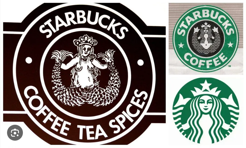
If you look at the Starbucks logo today, you see a masterclass in modern, minimalist design. It is a clean, green, symmetrical icon that carries instant global recognition. But if you were to peel back the layers of that design, you would find something entirely different: a gritty, brown, complex 16th-century Norse woodcut of a two-tailed siren.
For those of us obsessed with logo design, the Starbucks Siren is arguably the most successful example of “iterative simplification” in corporate history. It tracks the journey of a local Seattle coffee bean retailer growing into a global lifestyle brand.
Here is a case study on how Starbucks managed to modernize its identity without losing its soul.
1971: The Woodcut Roots
The original Starbucks logo was a far cry from the sleek vector graphic we see today. In 1971, the founders wanted an identity that captured the seafaring history of coffee and the port city of Seattle. They discovered a 16th-century woodcut of a “twin-tailed mermaid” (or Siren).
The original logo was rendered in brown, featured a complex, grainy woodcut texture, and—famously—depicted the Siren topless with her navel visible. It was earthy, historic, and undeniably counter-culture. It felt like a small, local shop—because that’s exactly what it was.
The Evolution Timeline
As the company grew, the logo needed to shift from an “local shop sign” to a “global brand asset.” The changes were methodical, stripping away noise to improve legibility at smaller scales.
| Era | Primary Changes | Strategic Goal |
| 1971 | Woodcut style, brown, topless Siren | Local identity, maritime heritage |
| 1987 | Changed to Green; Siren’s hair covered chest | Transition to corporate cleanliness |
| 1992 | “Zoomed in” on the face; removed navel | Improved legibility at small sizes |
| 2011 | Removed outer ring and text completely | De-branding; removing “Coffee” constraints |
2011: The “Zoom In” and the Power of De-branding
The most controversial, yet brilliant, move in the brand’s history occurred in 2011 for their 40th anniversary. Starbucks made the decision to remove the outer ring and the words “STARBUCKS COFFEE” entirely.
Many designers at the time criticized this as a reckless move. They argued that a brand needs its name to be recognized. But Starbucks had a different strategic goal: Diversification.
By removing the word “Coffee,” they signaled to the market that they were no longer just a bean retailer. They were a lifestyle brand. They could now sell sandwiches, salads, music, or merchandise without the name “Coffee” acting as a cognitive barrier to the customer. They effectively “de-branded” by removing the text, relying entirely on the visual equity they had spent 40 years building.
Key Takeaways for Logo Designers
What can we learn from the Siren’s transformation?
-
Simplicity Scales: The move from the 1971 woodcut to the 2011 icon wasn’t just about “looking modern.” It was about legibility. Complex illustrations are hard to reproduce on a small coffee sleeve or a tiny app icon. By stripping away the outer ring and the text, they ensured the Siren would be instantly recognizable at any size.
-
Don’t Erase Equity; Evolve It: Notice that Starbucks didn’t replace the Siren with a geometric shape or a random abstract logo. They kept the core character but refined her features. If you are rebranding a client with legacy, identify the one “hook” that people recognize and keep it, even if you simplify everything around it.
-
Design for Your Future, Not Your Present: In 1971, the logo reflected what the business was. In 2011, the logo reflected what the business wanted to become. If your client is planning to expand their product line in the next decade, ensure their logo doesn’t accidentally label them into a box they can’t escape.
The Siren’s evolution proves that a great logo is not a finished product—it is a living asset that should grow alongside the company it represents.


Leave a Reply