

When a brand crosses the century mark, its most valuable asset is no longer just its secret formula—it is its accumulated cultural history. Yet, for over a decade, Pepsi felt visually detached from its own golden era.
The soft drink giant rolled out its first major visual identity overhaul in 14 years across 120 markets. While technically marking its 125th anniversary, this massive pivot represents a “centennial epoch shift”—a masterclass in how a legacy brand can look backward to move forward.
Everyone loves to hate on corporate rebrands, but the public reception to Pepsi’s new look has been overwhelmingly enthusiastic. Here is a deep-dive case study into why this nostalgic makeover actually worked.

The Ghost of 2008: Fixing the “Smile”
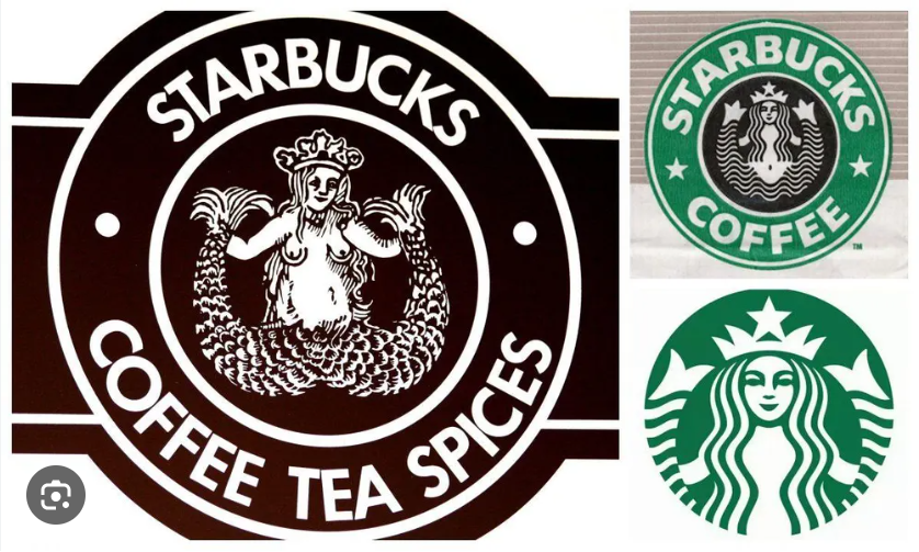
To understand why the new logo works so well, we have to look back at what it replaced. In 2008, Pepsi introduced an asymmetrical, ultra-minimalist globe logo designed by the Arnell Group. The design brief famously leaked, becoming a laughingstock in the design world due to its bizarre pseudo-scientific justifications involving the Earth’s gravitational pull, perimeter oscillations, and the Mona Lisa.
The resulting logo featured a thin, distorted white stripe meant to mimic a “smile.” The wordmark was shifted to a thin, lowercase sans-serif font that sat completely outside the globe.
To consumers, it felt weak, passive, and corporate. It lacked the punch and confidence needed to compete on crowded retail shelves. Worse, the asymmetrical wave quickly became an internet meme, frequently mocked for looking like an out-of-shape torso.
The Cognitive Breakthrough: Designing for Human Memory
When PepsiCo’s Chief Design Officer, Mauro Porcini, and his team began brainstorming the rebrand, they executed a simple but brilliant experiment. They asked thousands of consumers across the globe to draw the Pepsi logo from memory.
“We couldn’t ignore that kind of insight,” Porcini later noted. “Instead of rejecting it, we decided to embrace it.”
The results were uniform: even though the word “Pepsi” and the circular globe had been completely separated since 1992, the vast majority of people drew the word inside the circle.
Consumers fundamentally rejected the 2008 separation. Their brains held onto the nostalgic 1970s and 1980s iterations where the typography anchored the center of the tricolor badge. Pepsi’s team realized that instead of trying to force consumers to adapt to a corporate vision, the brand needed to adapt to the consumers’ collective memory.
Inside the Design System: Deconstructing the Elements
The new visual identity is far from a lazy copy-paste of a vintage asset. It is a “restomod”—a classic frame completely rebuilt with modern engineering.
-
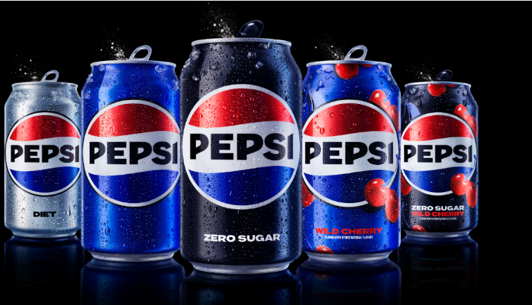
The Power of Black: The most significant structural change is the introduction of the color black into the core color palette. The wordmark is rendered in a heavy, unapologetic, all-caps custom sans-serif font in pitch black. A thick black border wraps around the entire globe. This wasn’t just an aesthetic choice; it strategically unites the flagship brand with Pepsi Zero Sugar, aligning with modern consumer shifts away from high-fructose corn syrup.
-
Electric Blue: The traditional navy blue from the previous generation was swapped for a highly saturated, vibrant electric blue. This shade is specifically optimized for digital screens, mobile apps, and broadcast animations, making the logo practically glow in Web3 and metaverse environments.
-
The Visual Pulse: The white wave slicing through the center of the globe is no longer a static line. In digital implementations, it behaves like a living audio wave or a heartbeat—a rhythmic pulse that ripples outward, letting the brand natively sync with music festivals, sports stadium screens, and interactive gaming streams.
Direct Comparison: The 2008 Layout vs. The Modern Evolution
| Design Attribute | The 2008 Logo System | The Modern Redesign |
| Typography Position | Separated; sat weakly underneath or beside the icon | Integrated; centered directly inside the globe structure |
| Lettering Style | Soft, lowercase, thin sans-serif font | Heavy, confident, uppercase custom typeface |
| Core Color Contrast | Low contrast; pastel red, white, and muted navy | High contrast; electric blue, vibrant red, and stark black |
| Strategic Focus | Abstract minimalism and friendly approachability | High-energy pop culture, digital flexibility, and zero-sugar |
Key Takeaways for Brand Designers
Pepsi’s rollout proves that nostalgia in branding is not about being old-fashioned; it is about leveraging existing brand equity. If your audience has spent decades building a specific mental model of your logo, erasing that map for the sake of “modernization” is a massive waste of cultural capital.
By merging the structural familiarity of their 1980s heritage with futuristic digital elements, Pepsi managed to satisfy two generations at once. They gave older consumers a comforting hit of authentic nostalgia while offering Gen-Z a bold, high-contrast aesthetic that cuts through the sterile, minimalist noise of the current internet.


Leave a Reply