

Whenever a list of the “most expensive logo designs in history” circulates online, one entry never fails to make designers and business owners double-take: British Petroleum (BP) and their infamous $211 million rebrand.
To the average onlooker, spending nine figures on a stylized green-and-yellow sunburst seems like absolute corporate madness. Did a design agency pull off the ultimate heist, or did a group of executives completely lose their minds?
The short answer is neither.
As identity designers dissecting case studies here at logodesigninspo.com, we need to bust the single biggest myth surrounding this project. BP did not hand an agency a check for $211 million just to export a digital vector file. The actual fee paid to Landor Associates for the creative design, strategy, and brand architecture was roughly $4.6 million—still a massive sum, but standard for an enterprise oil giant.
The remaining $206-plus million? That was the cost of radical, physical metamorphosis.
The Strategic Catalyst: Moving “Beyond Petroleum”
To understand the budget, you have to understand the massive shift BP was trying to signal in the year 2000. Following a series of mega-mergers with companies like Amoco, BP had evolved into an international powerhouse, but its visual identity was trapped in the mid-20th century.
For nearly 70 years, BP had utilized a traditional, rigid green-and-yellow shield. It screamed “heavy industrial oil drilling” at a time when the public, investors, and governments were beginning to demand environmental accountability and alternative energy solutions.
BP’s leadership team made a highly calculated, high-risk bet. They decided to pivot their market positioning from an international oil company to an integrated energy company. They introduced a legendary corporate tagline: “Beyond Petroleum.”
To make the public believe this environmental pivot, the cold, defensive metal shield had to go.
Deconstructing the ‘Helios’ Design
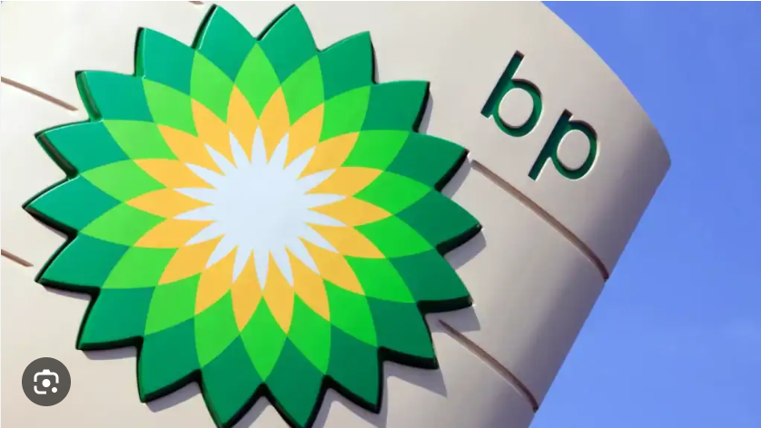
Landor Associates replaced the industrial shield with an interlocking, organic geometric icon named The Helios (named after the Greek god of the sun).
The design team abandoned traditional corporate styling cues for a multi-layered symmetrical shape that operates heavily on color psychology:
-
The Yellow Center: Represents the sun, solar energy, and the core genesis of all power on Earth.
-
The Interlocking Radiants: The sharp, overlapping geometric shapes double as stylized sunflower petals, naturally evoking growth and a harmony with nature.
-
The Color Spectrum: Shifting from bright yellow to vibrant light-green and ending in deep forest green, the gradient directly mimics clean energy, sustainability, and environmental preservation.
-
The Typography: The stark, uppercase “BP” initials inside the old shield were dropped entirely. They were replaced with a friendly, modern, lowercase sans-serif font tucked neatly above the symbol, making the massive corporation feel accessible and human-scale.
The $211 Million Breakdown: Real-World Implementation
Why did executing this simple graphic cost a fortune? Because a logo for a global energy giant doesn’t live on a laptop screen; it lives on thousands of tons of steel, plastic, and concrete.
When a multi-national oil company changes its identity, every single physical asset on the planet must be retrofitted or replaced to avoid legal liabilities and brand fragmentation. Let’s look at the sheer scale of the rollout:
| Rollout Asset | Estimated Scope of Implementation |
| Retail Gas Stations | Complete manufacturing, shipping, and installation of entirely new canopy structures and massive roadside pricing pylons across 28,000+ locations worldwide. |
| Industrial Fuel Pumps | Re-wrapping, painting, and updating the digital user interfaces on over 100,000 individual fueling nozzles. |
| Corporate Fleet | Complete graphic overhauls for thousands of oceanic tankers, fuel delivery trucks, aviation refuelers, and service vehicles. |
| Employee Uniforms | Redesigning and manufacturing flame-retardant apparel, hardhats, and corporate wear for over 100,000 global employees. |
| Legal & Global Trademarks | Securing international trademark protections for the interlocking geometric shape across more than 100 sovereign nations. |
When you divide $211 million across tens of thousands of physical facilities globally, the cost breaks down to roughly $7,500 per station. From a logistics and asset management perspective, the budget becomes entirely rational.
The Catch: The Danger of “Greenwashing”
While the Helios logo is highly regarded by design purists as a technical masterpiece of symmetry and gradient control, it also serves as the ultimate corporate cautionary tale about brand alignment.
By launching the “Beyond Petroleum” campaign, BP set an incredibly high ethical expectation. Environmental groups quickly pointed out that despite the green flower logo, less than 5% of BP’s capital expenditure was actually going into renewable energy at the time. The rest remained firmly rooted in fossil fuels.
The Ultimate Stress Test: The dangerous chasm between brand image and corporate reality fractured permanently during the catastrophic 2010 Deepwater Horizon oil spill. For months, international news channels broadcasted a live feed of oil billowing into the Gulf of Mexico, with the pristine, eco-friendly Helios logo stamped right next to the disaster coverage on TV screens.
The visual juxtaposition was devastating to BP’s reputation, proving that if an identity projects a philosophy that the underlying business model hasn’t fully caught up to, the public will eventually weaponize it.
Key Takeaways for Logo Designers
-
Logos Carry Real-World Weight: As digital designers, we often focus purely on pixels, aspect ratios, and vector handles. This case study reminds us that a logo change for a brick-and-mortar business triggers a massive logistical and financial footprint. Always design with physical application and production costs in mind.
-
Authenticity Trumps Aesthetics: A beautiful logo cannot fix a structural perception problem on its own. The design must reflect organizational truth. If a brand’s visual identity outpaces its actual corporate behavior, the market will eventually flag it as disingenuous.
-
True Rebranding is an Asset Overhaul: If a client thinks a rebrand just means updating their Twitter profile picture and keeping their outdated storefronts, mismatched uniforms, and old signs, they aren’t rebranding—they are just masking symptoms. True brand building requires full, systemic commitment.


Leave a Reply