

For nearly a century, Jaguar stood as the quintessential emblem of British automotive luxury. It was a brand defined by a distinct, unshakeable visual language: the purr of an internal combustion engine, British racing green paint, and the iconic “Leaper”—a sleek, muscular jaguar frozen mid-pounce, symbolizing raw power, speed, and status.
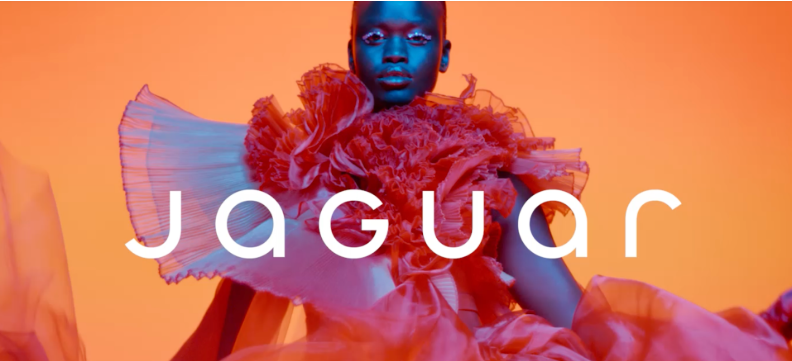
Then came the radical transformation. As part of its complete pivot to becoming a fully electric, ultra-luxury house, Jaguar executed one of the most polarizing, scorched-earth rebrands in modern corporate history. Out went the roaring cat, the classic heritage, and the traditional luxury tropes. In came a pastel-hued, avant-garde aesthetic anchored by the mantra: “Copy Nothing.”
Now that the dust has settled and the brand is rolling out its next-generation EV lineup, it’s time to step back for a clinical design case study. Was Jaguar’s radical makeover a masterstroke of futuristic repositioning, or did they accidentally drive a multi-billion-dollar legacy off a cliff?
The Elements of Disruption: Deconstructing the New Visual Identity
Jaguar didn’t just tweak its logo; they completely dismantled their visual architecture and rebuilt it using postmodern, minimalist geometry. The new identity rests on three core design pillars:
1. The Mixed-Case Device (The Wordmark)
The most jarring shift for typography purists was the new primary wordmark. It seamlessly blends upper and lowercase letters—specifically featuring a lowercase “a” and “g” alongside a capital “U”. The font is wide, geometric, and hyper-symmetrical, intentionally subverting traditional typographic hierarchy to project an elite, high-fashion art house vibe rather than an automotive manufacturer.
2. The “Strikethrough” Graphic (The Line Matrix)
A recurring motif across the new branding is a grid of horizontal lines cutting through spaces. It breaks up clean fields of color, acting as a visual signature that channels a mixture of computing code, structural ventilation, and modern architectural slats.
3. The Reimagined Monogram
The historic growling cat badge was replaced by a clean, circular emblem containing a stylized “J” and “E” flipped and interlocking back-to-back. It looks less like a car badge and more like a monogram you would find stamped on a luxury Italian handbag or a premium fragrance bottle.
Direct Comparison: Heritage Luxury vs. The Electric Future
| Branding Metric | Traditional Jaguar System | The Next-Gen Rebrand |
| Primary Typography | Classic, high-status serif/semi-serif lettering | Symmetrical, mixed-case geometric sans-serif |
| Core Symbolism | Literal, muscular animal in motion (The Leaper) | Abstract monogram and linear patterns |
| Color Psychology | British Racing Green, rich metallics, deep blacks | Pastel yellows, vibrant magentas, electric mint |
| Market Positioning | Premium executive performance cars | Ultra-luxury, high-fashion electric vehicles |
The “Copy Nothing” Controversy: Why the Internet Blew Up
When Jaguar dropped its initial launch campaign, it triggered an immediate digital firestorm. The debut promotional video featured models dressed in bright, gender-fluid, avant-garde jumpsuits stepping through surreal landscapes—but it didn’t feature a single car.
The backlash from automotive enthusiasts and marketing purists was swift and brutal. Critics accused Jaguar of corporate alienation, claiming the brand had abandoned its core demographic in favor of shallow, trendy corporate posturing.
The Strategic Reality: Jaguar’s leadership team, guided by Chief Creative Officer Gerry McGovern, knew exactly what they were doing. The shock value was entirely intentional. Jaguar was suffering from an aging demographic and stagnant sales. To survive the electric era, they didn’t just need a new car; they needed to shock the market into realizing that the old Jaguar was completely dead.
By stripping away the imagery of exhaust pipes and leather dashboards, Jaguar explicitly announced its transition upmarket. They were no longer competing with premium brands like BMW, Audi, or Mercedes-Benz. Instead, they were aiming their crosshairs directly at the bespoke, ultra-luxury tier inhabited by Porsche, Bentley, and Maserati.
Case Study Verdict: Bold Leap or Branding Disaster?
To judge this rebrand purely on social media comments is to misunderstand the long game of brand asset management.
Why It Might Be a Brilliant Move
True luxury thrives on polarization. By creating a visual identity that looks more at home at Paris Fashion Week than at a traditional auto show, Jaguar successfully detached itself from its old identity. For the young, ultra-wealthy, tech-forward EV buyers in markets like Silicon Valley, Shanghai, and Dubai, the new aesthetic feels fresh, artistic, and entirely unburdened by old-world nostalgia.
The Hidden Danger
The primary risk of Jaguar’s rebrand is the loss of historical differentiation. The old Jaguar logo had unmatched narrative power—you instantly felt the heritage. The new geometric wordmark, while pristine and executionally flawless, risks blending into the sea of minimalist, sterile “blandified” logos that have dominated the tech and fashion sectors over the last decade.
Key Takeaways for Brand Strategists
-
Align Disruption with Product Shift: Radical visual rebrands only work if the product match is equally disruptive. Because Jaguar is completely discontinuing its combustion cars and moving to a completely new mechanical architecture, erasing the old visual language was a strategic necessity.
-
Know Which Equity to Protect: Jaguar didn’t completely erase the Leaper; they refined it into a sleek, single-line graphic to be used sparingly as an accent marker. When executionally altering a legacy brand, keep a fractional thread of history alive for structural continuity.
-
Design for the Target, Not the Legacy: A rebrand should be engineered for the consumers you want, not just the consumers you have. Jaguar willingly sacrificed the nostalgia of car enthusiasts to build an aesthetic ecosystem that appeals to the high-fashion, high-net-worth buyers of tomorrow.


Leave a Reply