

In the world of graphic design, the circle is the ultimate shape. It has no beginning, no end, and no sharp corners. From a psychological standpoint, human brains are naturally drawn to round shapes because they project unity, wholeness, infinity, and protection.
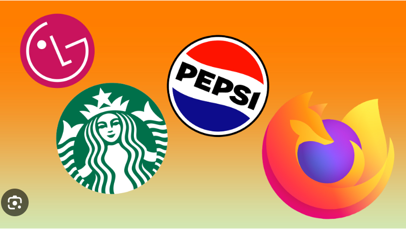
But in 2026, the circular logo has transitioned from an aesthetic choice into a strict digital necessity. Look at your phone: almost every app notification, Instagram profile, TikTok avatar, Discord icon, and website favicon is encapsulated in a perfect circle. A round logo is natively future-proof because it is born ready for the digital ecosystem.
If you are looking to harness the balancing power of the wheel for your brand, here are 30 round logo ideas across four distinct styles, followed by a breakdown of exactly why they work so brilliantly.
1. Minimalist & Geometric Rounds (Ideas 1–8)
Clean lines and structural geometry give round logos a modern, architectural, and tech-forward edge. These concepts rely on raw mathematical balance.
-
The Quartered Ring: A solid circular band missing a precise 90-degree segment, creating an asymmetrical open gap that invites the eye inward.
-
The Perfect Eclipse: A large, thin-lined circle partially overlapped by a smaller, offset solid circle, beautifully mimicking a lunar eclipse.
-
The Concentric Ripple: Three nested, concentric line-art circles of uniform weight that expand outward like a digital soundwave or water ripple.
-
The Symmetrical Crosshair: A sharp, minimal circle intersected perfectly by a fine horizontal and vertical crosshair axis, signaling target precision.
-
The Isometric Sphere Grid: A clean round disc mapped out internally by a subtle web of 3D wireframe lines, perfect for spatial computing or software infrastructure.
-
The Horizontal Split: A bold, solid circle cleanly divided across the exact center by a razor-thin line of negative space, creating an upper and lower horizon.
-
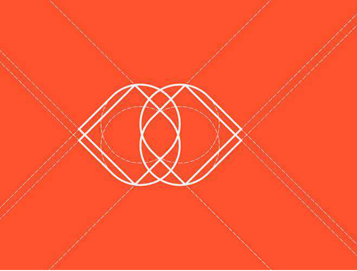
The Overlapping Transparencies: Two geometric circles intersecting with a soft opacity mask, creating a third, distinct color shade at their visual crossroads.
-
The Segmented Orbit: A central vector dot surrounded by a dashed, spinning orbital ring that projects perpetual motion and kinetic data.
2. Badges, Stamps & Heritage Crests (Ideas 9–15)
Circular badges evoke old-world authority, traditional craftsmanship, and institutional trust. They enclose information tightly, making them ideal for physical goods, restaurants, and apparel.
-
The Weathered Wax Seal: An imperfect, slightly organic round border that mimics poured stamping wax, enclosing a sharp, contrasting modern serif initial.
-
The Double-Ring Corporate: A classic mid-century layout featuring a thick outer ring and a thin inner ring, with the brand name curved neatly along the circular pathway.
-
The Twisted Rope Ring: A hand-drawn circular frame styled to look like a thick piece of nautical rope, instantly giving a brand a rugged, maritime heritage vibe.
-
The Star-Cluster Badge: A clean circular border topped with a symmetrical arc of five tiny stars, communicating elite status and premium quality.
-
The Serrated Stamp Edge: A round logo whose outer boundary features the jagged, zigzag teeth of a vintage postage stamp or bottle cap.
-
The Established Date Arch: A minimalist round frame where the bottom arc holds the company’s established year in tiny, spaced-out Roman numerals.
-
The Collegiate Seal: A multi-layered academic crest combining fine border lines, geometric patterns, and a central shield icon inside the circle.
3. Typographic & Monogram Circles (Ideas 16–22)
Using typography to form or fill a circle shows incredible design wit. These concepts turn text into a self-contained icon.
-
The Endless Wordmark Loop: A text-only logo where the brand name is repeated or stretched along a 360-degree circular path to form the actual boundary.
-
The Negative Space Monogram: A solid black circular block where the white space in the center perfectly drops out the silhouette of your brand’s initial.
-
The Interlocking Ligature Circle: Two cursive initial letters gracefully intertwined, with the outer swashes naturally curving around to form a smooth circular perimeter.
-
The O-Ring Feature: A standard, clean typographic wordmark where the letter “O” is scaled up dramatically and customized to act as the main brand icon.
-
The Split-Circle Initial: A bold capital letter cut completely in half vertically, with the left and right halves curved outward to mimic a split round shield.
-
The Continuous Ribbon Letter: A single, unbroken vector ribbon that twists smoothly in a circular motion to spell out a monogram letter.
-
The Underscore Terminal Disc: A stark sans-serif initial sitting inside a solid circle, underscored by a sharp terminal code line at the base of the frame.
4. Nature, Organic & Fluid Spheres (Ideas 23–30)
Nature loves circles. From planets to cells, round shapes represent life, flow, and ecosystem harmony. These concepts inject human warmth into your visual identity.
-
The Dual-Leaf Yin-Yang: Two minimalist botanical leaves curved in flawless harmony around each other to form a perfect circular silhouette, celebrating eco-sustainability.
-
The Topographic Terrain Disc: A solid circular frame filled with clean, flowing topographic elevation lines, capturing a deep connection to land and exploration.
-
The Sun & Soil Horizon: A clean circle divided horizontally; the top half features clean, radiating sun rays, while the bottom half displays raw, structured soil lines.
-
The Global Node Matrix: A sphere mapped out by microscopic connecting dots and clean vector intersections, perfect for decentralized networks or global logistics.
-
The Botanical Crescent Wreath: A delicate, fine-line branch of lavender or olive leaves curling gracefully to form three-quarters of an elegant circle.
-
The Liquid Mercury Drop: A stunning 3D-effect organic shape that looks like a glossy, smooth drop of liquid gold or mercury balancing in a perfect sphere.
-
The Biometric Whorl: A stylized fingerprint texture mapped strictly into a circular boundary, projecting personal identity, human touch, and biometric security.
-
The Multi-Modal Vortex: A dynamic, spiraling vortex icon built from fluid gradient blades, capturing themes of generative transformation and energy.
Why Round Logos Work: The Strategic Breakdown
Choosing a circular logo isn’t just an artistic decision—it’s a data-backed branding strategy. Here is why the circle commands so much authority in modern design:
1. Seamless Avatar Compatibility
The biggest headache in modern branding is making a logo fit everywhere. Square or horizontal logos often get awkwardly cropped or shrunk to microscopic sizes when forced into circular social media profile pictures. A round logo naturally owns the entire canvas of an avatar frame, utilizing 100% of the available real estate without any clipping.
2. The Psychological Comfort of Safety
In shape psychology, angular shapes like triangles and rectangles represent power, aggression, and strict boundaries. Circles, however, project emotional warmth, inclusivity, community, and safety. Because a circle has no sharp edges, it feels approachable and trustworthy to consumers on a subconscious level.
3. The “Enclosure Effect”
A circular boundary acts as a visual frame. It corrals your brand name and central icon into a single, cohesive unit, preventing the design from feeling disconnected or floating loosely on a webpage. This enclosure makes the logo highly scannable, allowing the human brain to process the entire brand identity at a single glance.
The Design Guardrail for Circular Success: When building a round logo, always prioritize the whitespace. Because text curved around a circle can easily bleed together, you must increase your letter-spacing (tracking) and ensure your line weights are bold and consistent. Test your circular creation at a tiny 16×16 pixels scale. If the text or core icon turns into an unreadable dark blur, strip away the inner clutter until the core shape breathes effortlessly.


Leave a Reply