

In a digital landscape heavily dominated by flat vector graphics and sterile corporate minimalism, modern brands are increasingly looking backward to stand out. Nostalgia is a powerful emotional accelerator. A retro or vintage logo does not mean a brand is outdated; rather, it signals authenticity, heritage, and time-tested craftsmanship.
By blending old-school design philosophies with clean, modern constraints, brands can capture an instant sense of warmth, personality, and trustworthiness that “perfect” contemporary logos often lack. From mid-century americana to groovy 1970s typography and ornate Art Deco geometry, retro revival is a massive branding tool for modern businesses.
To help you infuse your brand with timeless character, we have curated 35 retro and vintage logo concepts across four distinct eras of classic charm.
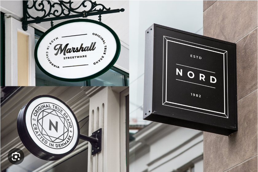
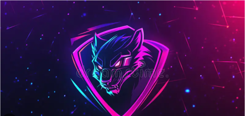
1. Mid-Century Badges & Stamps (Concepts 1–9)
The mid-century aesthetic (1940s–1960s) revolves around structural badges, industrial stamps, and clean Americana iconography. These layouts are incredibly resilient and provide a rock-solid foundation for service businesses, cafes, and apparel brands.
-
The Weathered Apothecary Seal: A classic circular stamp featuring distressed, raw textures and bold serif typography curved tightly around the inner border, housing a simple hand-drawn icon.
-
The Double-Ring Gas Station Emblem: A bold, mid-century corporate emblem utilizing two thick, concentric circles intersected by a sharp horizontal bar that holds the brand name.
-
The Monoline Diner Sign: A single-line vector illustration tracing a classic neon sign silhouette (like a coffee mug, bowling pin, or arrow) paired with a clean, rounded sans-serif font.
-
The Stencil Shipping Crate: A rugged, military-inspired block wordmark featuring intentional gaps in the letters, mimicking ink-stamped wooden cargo crates.
-
The Retro Route Shield: A highway-shield-shaped badge enclosing bold, condensed typography and a small star cluster, giving an immediate roadside adventure vibe.
-
The Irregular Wax Seal: A organic, slightly imperfect circular border that mimics a poured wax stamp, housing nothing but a single, hand-etched monogram letter.
-
The Collegiate Pennant Flag: A classic athletic felt pennant flag icon turned on its side, featuring a fluid, retro varsity script font stretching from base to tip.
-
The Geometric Sunburst Shield: A traditional crest or shield surrounded by thin, radiating sunburst lines, framing a stark, bold icon in its core.
-
The Curved Banner Overlay: A geometric circle layout where a solid, folded ribbon banner stretches across the middle to elegantly display the brand name.
2. Groovy 1970s & Liquid Typography (Concepts 10–18)
The 1970s brought warmth, playfulness, and organic expression to design. Characterized by thick lines, soft corners, and psychedelic influence, these concepts are perfect for lifestyle, creative, and community-centric brands.
-
The Psych-Rock Bubble Font: An ultra-thick, rounded custom script wordmark where the terminals of the letters smoothly droop and melt, projecting a fun, laid-back energy.
-
The Multi-Line Striped Ribbon: Typography built out of three or four parallel, offset vector lines looping together, mimicking classic 1970s tech and sports apparel logos.
-
The Warm Sunset Arc: Concentric geometric arcs rendered in a retro palette (mustard yellow, burnt orange, and terracotta cream) acting as a backdrop for a clean cursive logo.
-
The Retro Varsity Drop Shadow: Heavy block initials featuring a massive, solid 3D drop shadow projecting downward and to the left at a sharp 45-degree angle.
-
The Motel Key Tag Canvas: A minimalist illustration of the iconic plastic diamond-shaped vintage motel key tag, framing a playful, nostalgic brand name.
-
The Funky Offset Outline: A bold sans-serif logotype where the primary color block is slightly offset from a thick, contrasting black outline underneath.
-
The Hand-Drawn Whimsical Script: An irregular, casual cursive font that keeps its raw drawing imperfections, celebrating handmade authenticity.
-
The Curved Cooper Black Treatment: Embracing heavy, soft-edged serif typefaces arranged along a dramatic circular path to frame a central retro mascot.
-
The Checkered Border Square: A classic retro checkerboard pattern wrapping around a clean, square badge to house minimalist, high-contrast typography.
3. Industrial Heritage & Woodcut Linework (Concepts 19–27)
Industrial-era logos evoke blue-collar grit, raw machinery, and honest labor. Utilizing fine cross-hatching and deep textures, these designs build instant authority for micro-breweries, barbershops, and artisan workshops.
-
The Crossed Tools Crest: An anvil, crossed axes, or hammers arranged symmetrically inside a rugged, heavy-line shield framework.
-
The Linocut Botanical Sprig: A highly detailed, engraved-style vector illustration of a botanical plant, capturing the raw texture of a manual woodblock print.
-
The Technical Machinery Cog: A vintage industrial gear wheel drawn with precise technical sketch lines, conveying engineering mastery and heritage.
-
The Denim Rivet Button: A circular copper-toned badge designed to look exactly like a stamped metal jean button, featuring raised, industrial sans-serif lettering.
-
The Cross-Hatched Portrait: A detailed woodcut or scratchboard-style illustration of an animal or character profile, adding immense artistic value to a brand mark.
-
The Vintage Barber Pole Ribbon: A spiraling barber-pole vector element paired with sharp, traditional American-tattoo-style typography.
-
The Factory Smoke Silhouette: A minimalist silhouette of a mid-century brick factory roofline, complete with clean geometric smoke clouds forming abstract shapes.
-
The Distressed Stencil Monogram: A heavy, block-letter monogram with simulated ink bleeds and soft, rounded edges to mimic weathered industrial marking.
-
The Engraved Shaded Banner: An ornate, sweeping ribbon drawing featuring fine line-shading on the under-folds, holding an elegant, classic serif font.
4. Art Deco Luxury & Geometric Nostalgia (Concepts 28–35)
Representing the luxury, glamour, and optimism of the 1920s and 1930s, Art Deco relies on mathematical symmetry, bold geometric patterns, and vertical elegance. Essential for high-end boutique hotels, spirits, and premium fashion.
-
The Symmetrical Fan Grid: An intricate, overlapping grid of geometric arcs and lines forming a stylized fan pattern, executed in rich metallic gold lines.
-
The Tall Gatsby Serif: An ultra-tall, condensed capital serif wordmark featuring high contrast between thick stems and razor-thin crossbars.
-
The Stepped Border Frame: A thin, nested concentric square frame where the corners step inward symmetrically, channeling classic 1920s architecture.
-
The Monolithic Chevron Tower: Symmetrical, angular V-shaped chevrons stacked vertically to form an abstract, luxurious Art Deco spire.
-
The Abstract Sunray Arch: A tall, slender architectural archway containing clean geometric rays expanding outward from a central point.
-
The Diamond Monogram Frame: A sharp, elongated diamond outline holding clean, intertwined, high-contrast initials in negative space.
-
The Vintage Sovereign Emblem: A regal, highly symmetrical crest combining fine lines, micro-dots, and a single stylized star at the peak.
-
The Ornate Filigree Corner: A clean, minimal contemporary brand name framed perfectly by highly detailed, vintage Art Deco corner flourishes.
💡 Vintage Design Rules for Modern Execution
When building a vintage-inspired logo for a modern business, you must avoid making it look genuinely old and unreadable. Follow these three strategic guardrails:
1. Anchor Nostalgia with Modern Typography: If your central icon is highly detailed and vintage, pair it with a clean, perfectly kerned modern sans-serif subtitle. This grounds the logo in the present day and ensures it remains readable at a glance.
2. Limit Your Color Palette: True vintage printing was constrained by ink costs. To replicate an authentic retro feel, restrict your logo to a maximum of two or three solid colors. Lean heavily on historical tones: cream instead of blinding white, charcoal instead of harsh pitch-black, and muted earth tones instead of hyper-saturated neon colors.
3. Keep the Vector Core Clean: While distressed textures and grit look beautiful on a website or storefront sign, the core vector file of your logo should be 100% clean and sharp. Apply textures as an optional overlay rather than baking them into the master file, ensuring the logo can still scale perfectly onto a mobile app icon or favicon.


Leave a Reply